What I Learned From Designing AR Apps

What I Learned From Designing AR Apps
What I Learned From Designing AR Apps
Gleb Kuznetsov
2019-06-24T12:00:59+02:00
2019-06-24T12:37:19+00:00
The digital and technological landscape is constantly changing — new products and technologies are popping up every day. Designers have to keep track of what is trending and where creative opportunities are. A great designer has the vision to analyze new technology, identify its potential, and use it to design better products or services.
Among the various technologies that we have today, there’s one that gets a lot of attention: Augmented Reality. Companies like Apple and Google realize the potential of AR and invest significant amounts of resources into this technology. But when it comes to creating an AR experience, many designers find themselves in unfamiliar territory. Does AR require a different kind of UX and design process?
As for me, I’m a big fan of learning-by-doing, and I was lucky enough to work on the Airbus mobile app as well as the Rokid AR glasses OS product design. I’ve established a few practical rules that will help designers to get started creating compelling AR experiences. The rules work both for mobile augmented reality (MAR) and AR glasses experiences.
Rokid Glasses motion design exploration by Gleb Kuznetsov
Glossary
Let’s quickly define the key terms that we will use in the article:
- Mobile Augmented Reality (MAR) is delivering augmented reality experienced on mobile devices (smartphones and tablets);
- AR Glasses are a wearable smart display with a see-through viewing an augmented reality experience.
1. Get Buy-In From Stakeholders
Similar to any other project you work for, it is vital that you get support from stakeholders as early in the process as is possible. Despite being buzzed about for years, many stakeholders have never used AR products. As a result, they can question the technology just because they don’t understand the value it delivers. Our objective is to get an agreement from them.
“Why do we want to use AR? What problem does it solve?” are questions that stakeholders ask when they evaluate the design. It’s vital to connect your design decisions to the goals and objectives of the business. Before reaching stakeholders, you need to evaluate your product for AR potential. Here are three areas where AR can bring a lot of value:
- Business Goals
Understand the business goals you’re trying to solve for using AR. Stakeholders always appreciate connecting design solutions to the goals of the business. A lot of time business will respond to quantifiable numbers. Thus, be ready to provide an explanation off how your design is intended to help the company make more money or save more money. - Helpfulness For Users
AR will provide a better user experience and make the user journey a lot easier. Stakeholders appreciate technologies that improve the main use of the app. Think about the specific value that AR brings to users. - Creativity
AR is excellent when it comes to creating a more memorable experience and improving the design language of a product. Businesses often have a specific image they are trying to portrait, and product design has to reflect this.
Only when you have a clear answer to the question “Why is this better with AR?”, you will need to share your thoughts with stakeholders. Invest your time in preparing a presentation. Seeing is believing, and you’ll have better chances of buy-in from management when you show a demo for them. The demo should make it clear what are you proposing.
2. Discovery And Ideation
Explore And Use Solutions From Other Fields
No matter what product you design, you have to spend enough time researching the subject. When it comes to designing for AR, look for innovations and successful examples with similar solutions from other industries. For example, when my team was designing audio output for AR glasses, we learned a lot from headphones and speakers on mobile phones.
Design User Journey Using “As A User I Want” Technique
One of the fundamental things you should remember when designing AR experiences is that AR exists outside of the phone or glasses. AR technology is just a medium that people use to receive information. The tasks that users want to accomplish using this technology are what is really important.
“How to define a key feature set and be sure it will be valuable for our users?” is a crucial question you need to answer before designing your product. Since the core idea of user-centered design is to keep the user in the center, your design must be based on the understanding of users, their goals and contexts of use. In other words, we need to embrace the user journey.
When I work on a new project, I use a simple technique “As a [type of user], I want [goal] because [reason].” I put myself in the user’s shoes and think about what will be valuable for them. This technique is handy during brainstorming sessions. Used together with storyboarding, it allows you to explore various scenarios of interaction.
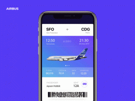
In the article “Designing Tomorrow Today: the Airbus iflyA380 App,” I’ve described in detail the process that my team followed when we created the app. The critical element of the design process was getting into the passenger’s mind, looking for insights into what the best user experience would be before, during and after their flight.
To understand what travelers like and dislike about the travel experience, we held a lot of brainstorming sessions together with Airbus. Those sessions revealed a lot of valuable insights. For example, we found that visiting the cabin (from home) before flying on the A380 was one of the common things users want to do. The app uses augmented reality so people can explore the cabin and virtually visit the upper deck, the cockpit, the lounges — wherever they want to go — even before boarding the plane.
IFLY A380 iOS app design by Gleb Kuznetsov. (Large preview)
App also accompanies passengers from the beginning to the end of their journey — basically, everything a traveler wants to do with the trip is wrapped up in a single app. Finding your seat is one of the features we implemented. This feature uses AR to show your seat in a plane. As a frequent traveler, I love that feature; you don’t need to search for the place at the time when you enter the cabin, you can do it beforehand — from the comfort of your couch. Users can access this feature right from the boarding pass — by tapping on ‘glass’ icon.

IFLY A380 app users can access the AR feature by tapping on the ‘glass’ icon. (Large preview)
Narrow Down Use Cases
It might be tempting to use AR to solve a few different problems for users. But in many cases, it’s better to resist this temptation. Why? Because by adding too many features in your product, you make it not only more complex but also more expensive. This rule is even more critical for AR experience that generally requires more effort. It’s always better to start with simple but well-designed AR experience rather than multiple complex but loose designed AR experiences.
Here are two simple rules to follow:
- Prioritize the problems and focus on the critical ones.
- Use storyboarding to understand exactly how users will interact with your app.
- Remember to be realistic. Being realistic means that you need to strike a balance between creativity and technical capabilities.
Use Prototypes To Assess Ideas
When we design traditional apps, we often use static sketches to assess ideas. But this approach won’t work for AR apps.
Understanding whether a particular idea is good or bad cannot be captured from a static sketch; quite often the ideas that look great on paper don’t work in a real-life context.
“
Thus, we need to interact with a prototype to get this understanding. That’s why it’s essential to get to prototyping state as soon as possible.
It’s important to mention that when I say ‘prototyping state’ I don’t mean a state when you create a polished high-fidelity prototype of your product that looks and work as a real product. What I mean is using a technique of rapid prototyping and building a prototype that helps you experience the interaction. You need to make prototypes really fast — remember that the goal of rapid prototyping is in evaluating your ideas, not in demonstrating your skills as a visual designer.
3. Design
Similar to any other product you design, when you work on AR product, your ultimate goal is to create intuitive, engaging, and clean interface. But it can be challenging since the interface in AR apps accounts both for input and output.
Physical Environment
AR is inherently an environmental medium. That’s why the first step in designing AR experience is defining where the user will be using your app. It’s vital to select the environment up front. And when I say ‘environment’, I mean a physical environment where the user will experience the app — it could be indoors or outdoors.
Here are three crucial moments that you should consider:
When my team designed Airbus i380 mobile AR experience, we took the available physical space into account. Also, we’ve considered the other aspects of interaction, such as the speed at which the user should make decisions. For instance, the user who wants to find her seat during the boarding won’t have too much time.
We sketched the environment (in our case, it was a plane inside and outside) and put AR objects in our sketch. By making our ideas tangible, we got an understanding of how the user will want to interact with our app and how our app will adapt to the constraints of the environment.
AR Realism And AR Objects Aesthetics
After you define the environment and required properties, you will need to design AR objects. One of the goals behind creating AR experience is to blend virtual with real. The objects you design should fit into the environment — people should believe that AR objects are real. That’s why it’s important to render digital content in context with the highest levels of realism.
Here are a few rules to follow:
- Focus on the level of details and design 3D assets with lifelike textures. I recommend using multi-layer texture model such as PBR (Physically Based Rendering model). Most AR development tools support it, and this is the most cost-effective solution to achieve an advanced degree of detail for your AR objects.
- Get the lighting right. Lighting is a very crucial factor for creating realism — the wrong light instantly breaks the immersion. Use dynamic lighting, reflect environmental lighting conditions on virtual objects, cast object shadows, and reflections on real-world surfaces to create more realistic objects. Also, your app should react to real-world changing of lighting.
- Minimize the size of textures. Mobile devices are generally less powerful than desktops. Thus, to let your scene load faster, don’t make textures too large. Strive to use 2k resolution at most.
- Add visual noise to AR textures. Flat-colored surfaces will look fake to the user’s eye. Textures will appear more lifelike when you introduce rips, pattern disruptions, and other forms of visual noise.
- Prevent flickering. Update the scene 60 times per second to prevent flickering of AR objects.
Design For Safety And Comfort
AR usually accompanied by the word ‘immersive.’ Creating immersive experience is a great goal, but AR immersion can be dangerous — people can be so immersed in smartphones/glasses, so they forget what is happening around them, and this can cause problems. Users might not notice hazards around them and bump into objects. This phenomenon is known as cognitive tunneling. And it caused a lot of physical traumas.
- Avoid users from doing anything uncomfortable — for example, physically demanding actions or rapid/expansive motion.
- Keep the user safe. Avoid situations when users have to walk backward.
- Avoid long play AR sessions. Users can get fatigued using AR for extended periods. Design stop points and in-app notifications that they should take a break. For instance, if you design an AR game, let users pause or save their progress.
Placement For Virtual Objects
There are two ways of placing virtual objects — on the screen or in the world. Depending on the needs of your project and device capabilities, you can follow either the first or second approach. Generally, virtual elements should be placed in world space if they suppose to act like real objects (e.g., a virtual statue in AR space), and should be placed as an on-screen overlay if they intended to be UI controls or information messages (e.g., notification).
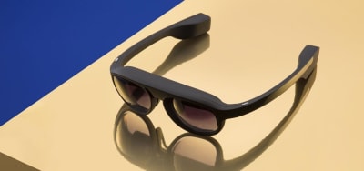
Rokid Glasses. (Large preview)
‘Should every object in AR space be 3D?’ is a common question among designers who work on AR experiences. The answer is no. Not everything in the AR space should be 3D. In fact, in some cases like in-app notifications, it’s preferable to use flat 2D objects because they will be less visually distracting.
Rokid Glasses motion design exploration by Gleb Kuznetsov. (Large preview)
Avoid Using Haptic Feedback
Phone vibrations are frequently used to send feedback in mobile apps. But using the same approach in AR can cause a lot of problems — haptic feedback introduces extra noise and makes the experience less enjoyable (especially for AR Glasses users). In most cases, it’s better to use sound effect for feedback.
Make A Clear Transition Into AR
Both for MAR and AR glass experiences, you should let users know they’re about to transition into AR. Design a transition state. For the ifly380 app, we used an animated transition — a simple animated effect that user sees when taps on the AR mode icon.
Trim all the fat.
Devote as much of the screen as possible to viewing the physical world and your app’s virtual objects:
- Reduce the total number of interactable elements on the screen available for the user at one moment of time.
- Avoid placing visible UI controls and text messages in your viewport unless they are necessary for the interaction. A visually clean UI lends itself seamlessly to the immersive experience you’re building.
- Prevent distractions. Limit the number of times when objects appear on the user screen out of the blue. Anything that appears out of the blue instantly kills realism and make the user focus on the object.
AR Object Manipulation And Delineating Boundaries Between The ‘Augment’ And The ‘Reality’
When it comes to designing a mechanism of interaction with virtual objects, favor direct manipulation for virtual objects — the user should be able to touch an object on the screen and interact with it using standard, familiar gestures, rather than interact with separate visible UI controls.
Also, users should have a clear understanding of what elements they can interact with and what elements are static. Make it easy for users to spot interactive objects and then interact with them by providing visual signifiers for interactive objects. Use glowing outlines or other visual highlights to let users know what’s interactive.
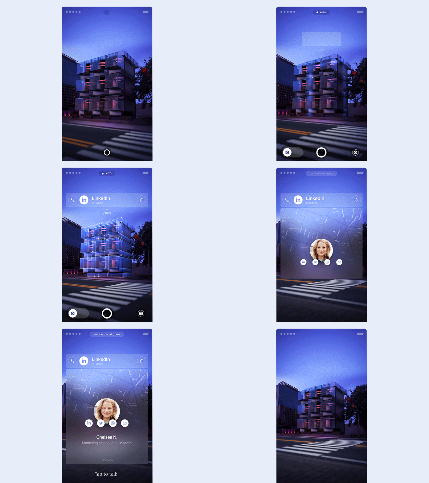 Scan object effect for outdoor MAR by Gleb Kuznetsov. (Large preview)
When the user interacts with an object, you need to communicate that the object is selected visually. Design a selection state — use either highlight the entire object or space underneath it to give the user a clear indication that it’s selected.
Last but not least, follows the rules of physics for objects. Just like real objects, AR objects should react to the real-world environment.
Design For Freedom Of Camera
AR invites movement and motion from the user. One of the significant challenges when designing or AR is giving users the ability to control the camera. When you give users the ability to control the view, they will swing device around in an attempt to find the points of interest. And not all apps are designed to help the user to control the viewfinder.
Google identifies four different ways that a user can move in AR space:
The first three ways are common for mobile AR while the last one is common for AR glasses.
In some cases, MAR users want to rotate the device for ease of use. Don’t interrupt the camera with rotation animation.
Consider Accessibility When Designing AR
As with any other product we design, our goal is to make augmented reality technology accessible for people. Here are a few general recommendations on how to address real-world accessibility issues:
- Blind users. Visual information is not accessible to blind users. To make AR accessible for blind users, you might want to use audio or haptic feedback to deliver navigation instructions and other important information.
- Deaf or hard-hearing users. For AR experience that requires voice interaction, you can use visual signals as an input method (also known as speechreading). The app can learn to analyze lip movement and translate this data in commands.
If you’re interested in learning more practical tips on how to create accessible AR apps, consider watching the video talk by Leah Findlater:
Encourage Users To Move
If your experience demands exploration, remind users they can move around. Many users have never experienced a 360-degree virtual environment before, and you need to motivate them to change the position of their device. You can use an interactive object to do that. For example, during I/0 2018, Google used an animated fox for Google Maps that guided users to the target destination.
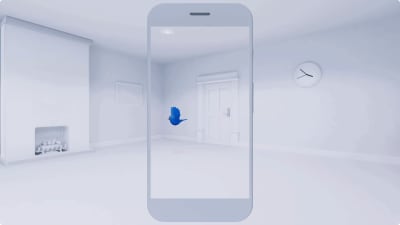
This AR experience uses an animated bird to guide users. (Large preview)
Remember That Animation Is A Designer’s Best Friend
Animation can be multipurpose. First, you can use a combination of visual cues and animation to teach users. For example, the animation of a moving phone around will make it clear what users have to do to initialize the app.
Second, you can use animation to create emotions.
One second of emotion can change the whole reality for people engaging with a product.
“
Well-designed animated effects help to create a connection between the user and the product — they make the object feel tangible. Even a simple object such as loading indicator can build a bridge of trust between users and the device.
 Rokid Alien motion design by Gleb Kuznetsov. (Large preview)
A critical moment about animation — after discovering the elements of design and finding design solutions for the animation base, it’s essential to spend enough time on creating a proper animated effect. It took lots of iterations to finish a loading animation that you see above. You have to test every animation to be sure it works for your design and be ready to adjust color, positioning, etc. to give the best effect.
Prototype On The Actual Device
In the interview for Rokid team, Jeshua Nanthakumar mentioned that the most effective AR prototypes are always physical. That’s because when you prototype on the actual device, from the beginning, you make design work well on hardware and software that people actually use. When it comes to unique displays like on the Rokid Glasses, this methodology is especially important. By doing that you’ll ensure your design is implementable.
 Motion design language exploration for AR Glasses Rokid by Gleb Kuznetsov. (Large preview)
My team was responsible for designing the AR motion design language and loading animation for AR glasses. We decided to use a 3D sphere that will be rotated during the loading and will have nice reflections on its edges. The design of the animated effect took two weeks of hard work of motion designers and it looked gorgeous on high-res monitors of our design team, but the final result wasn’t good enough because the animation caused motion sickness.
Motion sickness often caused by the discrepancies between the motion perceived from the screen of AR Glasses and the actual movement of the user’s head. But in our case, the root cause of the motion sickness was different — since we put a lot of attention in polishing details like shapes, reflections, etc. unintentionally we made users focus on those details while the sphere was moving.
As a result, the motion happened in the periphery, and since humans are more sensitive to the moving objects in the periphery this caused motion sickness. We solved this problem by simplifying the animation. But it’s critical to mention that we won’t be able to find this problem without testing on the actual device.
If we compare the actual procedure of testing of AR apps with traditional GUI apps, it will be evident that testing AR apps require more manual interactions. A person who conducts testing should determine whether the app provides the correct output based on the current context.
Here are a few tips that I have for conducting efficient usability testing sessions:
- Prepare a physical environment to test in. Try to create real-world conditions for your app — test it with various physical objects, in different scenes with different lighting. But the environment might not be limited to scene and lighting.
- Don’t try to test everything all at once. Use a technique of chunking. Breaking down a complex flow into smaller pieces and testing them separately is always beneficial.
- Always record your testing session. Record everything that you see in the AR glass. A session record will be beneficial during discussions with your team.
- Testing for motion sickness.
- Share your testing results with developers. Try to mitigate the gap between design and development. Make sure your engineering team knows what problem you face.
Conclusion
Similar to any other new technology, AR comes with many unknowns. Designers who work on AR projects have a role of explorers — they experiment and try various approaches in order to find the one that works best for their product and delivers the value for people who will use it.
Personally, I believe that it’s always great to explore new mediums and find new original ways of solving old problems. We are still at the beginning stages of the new technological revolution — the exciting time when technologies like AR will be an expected part of our daily routines — and it’s our opportunity to create a solid foundation for the future generation of designers.

(cc, yk, il)
From our sponsors: What I Learned From Designing AR Apps


