How To Stop Analysis Paralysis With Design
How To Stop Analysis Paralysis With Design
Suzanne Scacca 2019-11-11T10:30:00+00:00
2019-11-11T12:35:39+00:00
As a web designer, you do your best to remove friction from the decision-making process. You place only one CTA above the fold. You keep interactive elements to a minimum. You make the menu only as large as it needs to be.
But what happens when the content itself causes analysis paralysis?
There’s an overabundance of choice all around the web, from e-commerce stores with thousands of products to content generation machines pushing out new posts every day. While you can’t do anything to stop the flood of information or items going out to your visitors, you can design your interfaces in a way that makes the decision-making process easier to bear. What’s more, you can help them walk away feeling more confident with their choice, too.
Let’s look at what it is about the psychology of choice that can be detrimental for conversions and what you can do to keep your PWA visitors from succumbing to it.
Why Analysis Paralysis Is Hurting Your Conversion Rate
Paralysis by analysis is what happens when someone finds a situation or decision too overwhelming or difficult. Despite thinking over the circumstances or options, they’re unable to make a clear choice, often leading to no action at all.
It’s the exact opposite of what we want to happen with our visitors and customers. And, yet, we see it all the time.
Take Amazon, with its hundreds of millions of products. Let’s say a shopper is looking for socks for an upcoming snowboarding trip. So, they search for “snowboard socks”:

There are 728 matching results for snowboard socks. While that’s nothing compared to the size of Amazon’s marketplace, it’s still way too many results to sift through on one’s own.
So, the shopper decides to narrow their search down to “knee-high snowboard socks antimicrobial compression”, which hits all of the key features they’re looking for:

That takes the list of 728 products down to a more manageable 8. However, there are a number of problems with this.
For starters, Amazon doesn’t actually present only eight options. The first thing it shows is a banner with sponsored results:
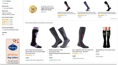
The next two rows do contain organic search results. However, the products either don’t have any reviews or high enough ratings to rave about.
To make matters worse, Amazon adds three more rows of sponsored products to the end of this page:

Essentially, Amazon has tripled the number of products the shopper has to look at now. Not only that, but one could argue that it’s polluted the search process with so many paid products.
It’s just a poor experience all around.
It’s a similar story on mobile. The main difference is that, when the narrow search is applied, only five results remain. That said, Amazon continues to muddle search results by prioritizing sponsored posts. This is what the shopper sees above the fold:
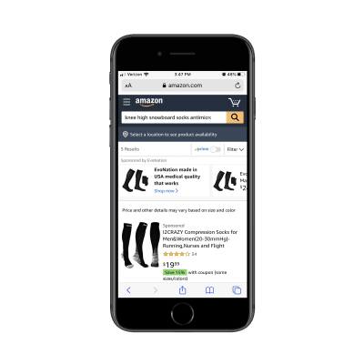
Once the shopper scrolls, they’ll see two organic products (with no ratings, much less) before being shown yet another sponsored product:

What should have been a succinct product search page ends up running on and on with sponsored listings and Amazon recommendations. As you can imagine, this is an even bigger problem for mobile shoppers who don’t have the patience or time to waste.
How To Simplify Decision-making With Design
Psychologist Barry Schwartz gave a TED talk on this exact problem and explained how it doesn’t just lead to abandoned purchases, but to less satisfying purchases.
Essentially, Schwartz argues that too many choices cause consumers to:
- Have too-high expectations whereby no option ever seems perfect or satisfying.
- Focus on minute details or features they missed out on by not making a different choice.
- Regret the option they settled on even if it proved to be the best.
- Blame themselves for spending too much time analyzing a decision and still making the “wrong” choice.
In other words, an abundance of choice puts your audience in the wrong state of mind. And if your site or PWA can’t afford to process returns or watch visitors walk away at a rate that a company like Amazon can, then you can’t let paralysis analysis become part of the decision-making process to begin with.
Here are some things you can do to make decision-making more bearable, even with too many options available.
Prioritize Your “Big Rock”
There’s a productivity hack called the “Big Rocks” method. Essentially, it says that if you want to get more stuff done, you have to take on your biggest challenge or priority first thing. All of the smaller tasks and requests nagging at you get slotted in once you’ve tackled the most critical ones.
And now I’m suggesting you do something similar with your design.
Basically, what you want to do is this:
- Look at all of the “stuff” you’re trying to put in front of your visitors.
- Ask yourself (or your client): “Which one takes top priority right now?”
- Then, stick it to the top of your home page.
Why do this? Well, for starters, it’s much less overwhelming to show one thing than to throw everything you have at your visitors right away — or to force them to dig around and figure out where to start. Plus, chances are good that there’s something especially pressing you want every visitor to see.
BarkShop shows us one way you might do this:

Notice how the top of the page isn’t littered with an inventory. Instead, the primary focus is on the Halloween sale.
This is clearly BarkShop’s big rock right now. If they don’t get their Halloween items out the door by October 31, they run the risk of losing money on the seasonal inventory. And while they could leave it up to their visitors to assume there are Halloween toys and treats available, why do that?
It’s hard enough showing up on a site like this and deciding what you’re going to buy for your dog this month. So, let your big rock become their guide.
You can see that it’s not just about the Halloween line either. Just below the banner, BarkShop has prioritized its top-trending toys. This is another trick you can use when designing product inventories and news sites. Display the most popular or top-rated/shared items first. There’s a greater likelihood they’re going to click on something that others have shown interest in than a bunch of random items they have to explore on their own.
Another way you might tackle big rocks in design is to go the way of Apple:
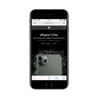
Again, Apple could’ve shown a bunch of its iPhones and iPads here or pointed visitors to different categories of products and accessories to explore. Instead, it’s put its big rock right up front: the iPhone 11 Pro.
Sure, there are probably plenty of Apple customers who come here looking for older models. But what makes more sense?
- Showing a bunch of similar-looking smartphone graphics that visitors are immediately put into analysis paralysis mode with?
- Or showing them the latest model that everyone wants?
You can do this with other kinds of websites, too. Blogs, for instance, will use the sticky post feature to show off their “big rocks” to every visitor who stops by. This might be the most popular post of all time or it could be something relevant to something happening at the moment.
Whatever it is, there’s a conscious decision made to stop visitors in their tracks and give them a moment of calm before they have to enter decision-making mode.
Gate Off the Choices
While you want your visitors to know that there’s a plenitude of things available, you don’t need to tell them how much there is. It’s only going to add to the pressure of the decision-making process.
So, whenever you can, gate off the choices.
eHealth Insurance is a website where Americans can purchase health insurance for themselves or their companies. With a wide variety of healthcare providers and dozens of plans available for each, a service like this is necessary for insurance-wielding U.S. citizens.

The only decision it asks visitors to make is what kind of insurance they’re looking for. It then asks them to fill out a simple enough form. It’s what eHealth Insurance uses to pare down the options:
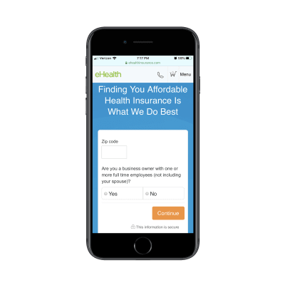
Once filled out, eHealth Insurance shows the user a list of providers and plans that are available in their area. This keeps the consumer from having to:
- Visit individual health insurance websites to do their own research.
- Sift through hundreds of options all at once (some of which they’d probably be ineligible for and others that would just be a bad fit).
Websites like these typically allow you to compare up to three items at once, making the decision-making process even simpler.
Another way to gate off your choices is by asking visitors to start narrowing their choices from the moment they arrive as Sotheby’s International Realty does:
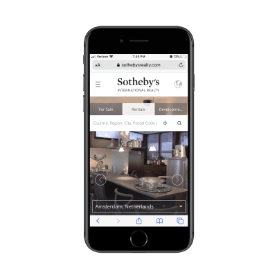
This way, consumers aren’t distracted by all the great-looking properties or even the attractive prices. They’re still focused on taking action (e.g. finding a rental), but it’s more about taking baby steps towards the desired result which makes it much less intimidating. It’s also going to lead to a more satisfying result in the end as they won’t spend time looking at rentals they can’t afford, that don’t allow cats or that are too far away from their kids’ schools.
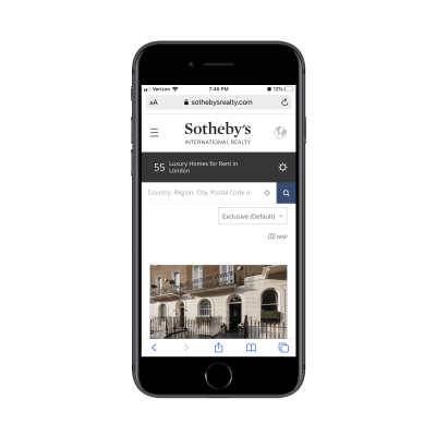
The next page of the Sotheby’s search process starts to show matching results, but not before letting them know that there are “55 Luxury Homes for Rent in London”. And if that number is just too much to handle, that’s fine. Directly to the right of that note is a filters widget.
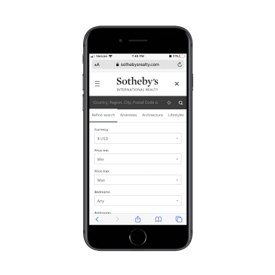
Sotheby’s filters are great. Not only are all the essentials covered, but it’s even divided up the filters by category.
Let’s recap how smooth this experience is going to be for already-anxious home-buyers or renters:
- The first thing they see on the Sotheby’s home page is a search bar.
- If they do the search, the next thing they see is the number of properties in the area.
- If that number is too intimidating, the filters widget is there to help them narrow the list even more.
By keeping the rentals off of the home page and even away from the top of the fold of the internal page, Sotheby’s can control how calmly visitors go through the decision-making process.
Enable Side-by-side Comparison
Internally, there’s not a lot you can do about choice overload except giving your visitors a really great set of sorting and filtering tools. Even then, once they start to see lists of related products, recommendations on previous purchases and so on, the analysis paralysis is going to creep back in.
One thing you can do to make this less stressful is by including side-by-side comparisons.
It’s similar to laying out pricing plans side-by-side. Rather than make prospective customers review their options one-by-one, stack up the top few choices. Then, align the specifications so it’s as easy as looking across a row to weed something out because it doesn’t fit the budget or the product is too large.
Although Amazon doesn’t handle analysis paralysis flawlessly, I do like what it does with its side-by-side product comparisons:

I can’t tell you how many times I’ve struggled to make a decision on Amazon, only to discover one of these comparison tables and immediately been able to make up my mind. It’s just so much easier to see a bunch of lookalike products all at once and to say “This one definitely won’t fit in my kitchen” or “That’s the exact color I’m looking for”.
You can do this with other kinds of websites, too. Verizon Wireless, for example, uses a side-by-side comparison to make choosing between its plans easier.
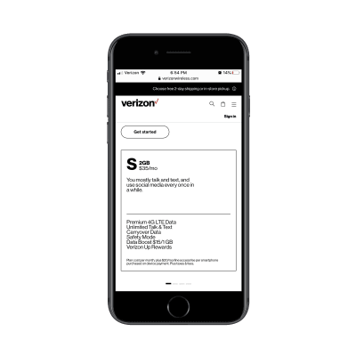
There are scroller dots below this block that indicate to customers that there’s more to be found. All they have to do is scroll to reveal more plan options. And because the scroller breadcrumbs are kept to a reasonable amount, this doesn’t seem like that burdensome of a task.
The next block over, for instance, contains the information for the 4GB plan:
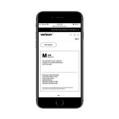
Even though the specs can’t be seen see side-by-side, the details are simply broken down and are consistently laid out. So, when someone moves from plan to plan, the same details are in the same place which makes flipping back and forth quite easy.
Another thing I really like about this is the summary provided at the top of each card. The 2GB one tells customers right away that it’s the best plan if you mostly talk and text whereas 4GB is better if you stream a lot of content and surf the web. This way, if all the technical details don’t mean much to customers, the layman’s summary will help them more confidently decide.
While I realize side-by-side comparisons might be something you’d normally try to avoid on mobile screens, these two examples show that it is possible to do so without introducing too much friction to the experience.
Wrapping Up
As I said before, you can’t do anything about scaling back the multitude of options your clients want to present their audiences with. If they want to sell thousands of products to customers that are demanding them, then good for them.
That said, the way you design around these options can have an impact on how well or poorly they’re received. Just remember what Barry Schwartz teaches us about the psychology of choice. If your visitors, users or customers walk away feeling overwhelmed, drained or disappointed with the experience, it’s going to cost you. So, be mindful of how much you present the options to them.
(ra, yk, il)
From our sponsors: How To Stop Analysis Paralysis With Design


