How To Make Cross-Browser Testing More Efficient With LambdaTest
How To Make Cross-Browser Testing More Efficient With LambdaTest
Suzanne Scacca 2020-02-18T11:00:00+00:00
2020-02-19T12:36:36+00:00
Before consumers sat in front of mobile devices for hours every day, there were numerous browsers and operating systems web designers had to contend with. So, it’s not like the concept of cross-browser testing is new.
Because web browsers don’t always render websites the same way or process data in the manner originally intended, cross-browser testing has long been an important part of web design and development. It’s the only way to ensure that what’s built behind the scenes is properly implemented on the frontend of a website.
But it can quickly become a tedious undertaking if you attempt to review every browser, OS and device on your own.
Fortunately, we’re living in an era where automation is king and we now have a better way of conducting cross-browser tests (and more frequently, too). So, let’s talk about why you need to automate this process and how to do so with the help of LambdaTest.
An Improved Way To Handle Cross-Browser Testing
When you set out to build a website for your users, you account for who they are, what they need and what they will respond to along their journey. But how and when do you address the different outcomes your users might experience thanks to their browser choice?
Responsive design may help mitigate some of these differences, but it’s not a cure-all for the inherent display issues between browsers and devices.
“
And if you want to make sure extensive cross-browser testing doesn’t have a negative impact on your bottom line, then automating it is the way to go.
Here are some tips to help you build automated testing into your process:
Familiarize Yourself With Browser Support Differences
This is a roundup from Statista of the top web browsers by market share:
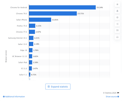
Now, the issue here isn’t necessarily that every browser processes your website data differently. What’s really mucking things up is the engine powering the browser behind the scenes.
For example, these are the engines the leading web browsers use:
- Chrome uses Blink + V8;
- Edge uses Blink;
- Firefox uses Quantum/Gecko + SpiderMonkey;
- Safari uses WebKit + Nitro;
- Internet Explorer uses Trident + Chakra.
Many of these engines render the same piece of code differently. For example, look at this experiment created by LambdaTest:

The date HTML tag is one of the most used tags and, yet, Chrome, Firefox and Opera are the only ones that fully support it — as indicated in the top blue bar above the test area. Even then, these browsers provide very different user experiences.
For example, the image above shows you what the date tag looks like in Chrome. Here’s how the same code displays in Edge:
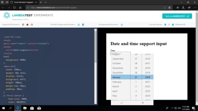
Not only does the font styling and sizing slightly different, but the way in which the date selection dropdown appears is vastly different.
So, before you start thinking about cross-browser testing and hammering out the kinks between these browsers and engines, familiarize yourself with the key differences.
A tool you can use as reference is Can I use….
You can look for discrepancies in the most commonly used components and technologies. Take, for instance, CSS grid layout:

Most of the leading (and some not so leading) browsers support CSS grid layout (the ones in green). Internet Explorer (in blue) provides partial support and Opera Mini (in purple) provides none at all.
Or let’s say you’re trying to use more WebP images in your designs as they’re much better for performance and resolution. Here’s what Can I use… tells us about browser support for the image format:

The most recent versions of Internet Explorer and Safari (web and mobile) do not provide support for it. So, if you intend on designing with WebP images, you’ll have to create a workaround for these browsers.
Bottom line: Take the time now to understand what kind of content or code is supported, so you can more effectively build a website from the get-go.
Pro Tip: Create a Browser Matrix for Reference
You can see why it’s so important to understand the differences between browser renderings and support. The more you familiarize yourself with them, the less scrambling you’ll have to do when a new discrepancy is discovered.
To make it easier on yourself, it would be a good idea to create a browser matrix for all these differences now.
Here’s a simple one that LambdaTest has designed:

I’d recommend creating one of your own. You can leverage data from Can I use… as well as documenting support issues you’ve encountered in your own projects.
This will also help you set priorities when you’re designing. For example, you can decide which non-supported features are worth using based on what kind of impact they have on your website’s goals.
It would also be useful to have this spreadsheet on hand once a site has gone live. Using data from Google Analytics, you can start prioritizing design choices based on which web browsers your users primarily use.
Get Yourself A Cross-Browser Testing Tool That Does It All
It doesn’t matter the size of the websites you build. All public-facing sites would benefit from an automated cross-browser testing tool.
What’s especially nice about automating with LambdaTest is that it gives its users options. From fully automated tests that check how your code impacts the frontend to semi-automated tasks that ease the work in managing updates and bugs, there are so many ways to automate and optimize your process.
Here are some of the feature highlights you should know about:
Real Time Testing: Best for Bug Tracking
Real-time testing is useful when there’s something targeted you need to examine with your own two eyes. Like if you’ve shipped a design to the client for review and they insist something doesn’t look right on their end, you can review the website using their exact configuration. It would also be helpful for confirming bugs and sussing out which browsers are impacted.
From the Real-Time Testing panel, you’ll enter your site URL and then choose your viewing specifications.
It lets you get super specific, choosing from:
- Mac vs. Android,
- Device type,
- Device version,
- Operating system,
- Web browser.

Once the test begins, this is what you’ll see (depending on the type of device you choose, of course):
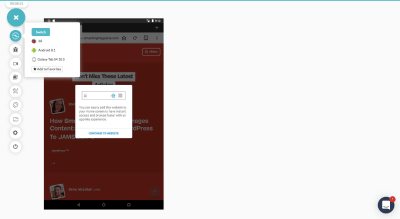
Above, you can see the first option in the sidebar enables you to quickly switch the device view. That way, if you have a couple of browser views you’re trying to compare or check errors on, you don’t have to backtrack.
As far as the other real-time testing options go, most of them are useful for identifying and reporting issues within the context that they actually happened.

In the bug tracking tool above, you can pinpoint a spot on the page where an error has occurred. You can then mark it up using a number of tools on the sidebar.
Users can also use the screenshotting and video options to capture bigger errors — especially ones that occur when you move through or engage with the site.
Screenshot Testing: Best for Speeding Up Manual Testing
There’s no reason you or your QA can’t still review your website on your own. That said, why make the process take longer than it needs to? You can let LambdaTest’s Visual UI Testing tools speed up the process.
The Screenshot tool, for instance, enables you to select all of the devices and browsers you want to compare at once:
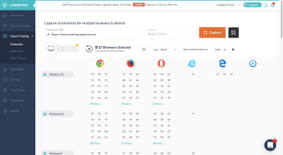
When the test completes, you’ll have all requested screenshots in one place:

You can view them here, download them to your computer or share them with others.
You can also organize your screenshots by project and version/round. That way, if you’re working through multiple rounds of revisions and want to refer back to a previous version, all copies of the previous iteration exist here. (You can also use screenshots in regression testing which I’ll explain shortly.)
Responsive Testing: Best for Confirming a Mobile-first Experience
If you need to see more than just a static screengrab, Responsive tests have you covered. All you need to do is select which OS and devices you want to compare and the tool will populate full working versions of the site in the mobile browser:
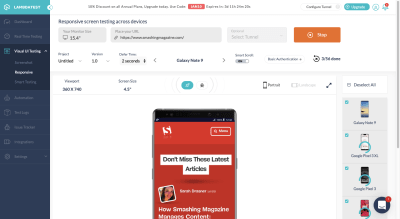
You can review your website’s design and interactivity not just in all possible browsers, but you can change the orientation of the site as well (in case issues appear when it goes landscape).
What’s nice about this testing tool is that, if anything appears wonky, you can mark the bug the second you detect it. There’s a button for you to do that directly above the interactive mobile browser. That’ll get those costly mobile errors reported and resolved more quickly.
Smart Testing: Best for Regression Testing
The eye can only detect so much, especially when you’ve been looking at the same section of a web page for weeks.
So, when you start implementing changes on your site — during development, just prior to launch and even afterwards — regression testing is going to be crucial for catching those potentially hard-to-spot issues.
This should take place any time something changes:
- You manually update part of the design.
- Code is tweaked on the backend.
- Someone reports a bug and the fix is implemented.
- Software is updated.
- An API is reconnected.
If you know which page and which part of that page are directly impacted, smart testing can make light work of confirming that everything is okay.
Just upload the original screenshot of the impacted page and then add a comparison image when the change has been made. (This is where that Screenshot tool really comes in handy.)

Note: There’s obviously nothing wrong with the Smashing Magazine website. But what I did in the example above is use renderings for different versions of the iPhone. Obviously, that’s not how regression tests work, but I wanted to show you how this comparison feature looks when something’s amiss.
Now, as for why this feature is so awesome, here’s how it works:

This single screenshot allows you to see where the two versions of your page no longer align. So, if the screenshots had been from the same browser view originally, this could be a problem if you hadn’t planned on realigning all of the elements.
You could also use the side-by-side comparison tests to check the same thing:
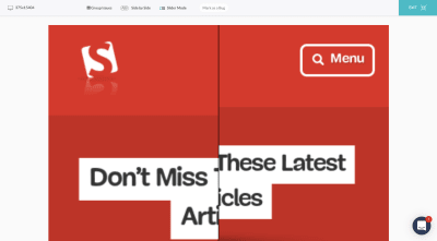
Again, smart testing is meant to help you quickly locate and report issues during regression testing. Find the method that works best for you, so you can get these issues resolved as quickly as possible from now on.
Automated Testing: Best for Detecting Issues on a Larger Scale
Technically, everything we’ve looked at so far has some form of automation built in, whether it’s processing 20 different browser screenshots simultaneously or letting you instantly see mobile test interfaces for all iOS and Android devices at once.
That said, the LambdaTest platform also comes with a tool called “Automation”. And what this does is enable you to do Selenium testing in the cloud on over 2,000 browsers. A newer feature, “Lambda Tunnel”, can be used to do Selenium testing on your localhost as well. That way, you can see how your code changes appear even before they go live.
There are tons of benefits to combining LambdaTest with Selenium testing:
- It’s a highly efficient way to conduct large quantities of cross-browser tests, thereby increasing your browser coverage (something that’s impossible to do manually).
- With parallel cross-browser tests, you’ll reduce the time spent executing automation tests as a whole.
- Because Selenium testing starts by identifying your preferred coding language, it can more intelligently detect errors that will appear in browsers.
Of course, the biggest benefit of using the LambdaTest Selenium Automation Grid is that LambdaTest will help you evaluate whether or not your tests pass or fail.

You still have to review the results to confirm that all errors are true failures and vice versa, but it’s going to save you a lot of time and headaches having LambdaTest do the initial work for you.
Wrapping Up
Cross-browser testing isn’t just about making sure websites are mobile responsive. What we’re ultimately looking to do here is take the guesswork out of web design. There may be over a dozen possible browsers and hundreds of browser/device configurations, but automated cross-browser tests can make checking all of these possibilities and locating errors much easier.
(ms, ra, yk, il)
From our sponsors: How To Make Cross-Browser Testing More Efficient With LambdaTest


