CSS Transitions In Vuejs And Nuxtjs
CSS Transitions In Vuejs And Nuxtjs
Timi Omoyeni 2020-07-10T09:00:00+00:00
2020-07-10T12:06:32+00:00
Transitions are a module of CSS that lets you create gradual transitions between the values of specific CSS properties. The behavior of these transitions can be controlled by specifying their timing function, duration, and other attributes. Using these transitions in your applications and websites create a better visual experience and sometimes draws and holds the user’s attention while a piece of information is being introduced to or leaving the screen. According to Can I Use, transitions are supported by most browsers, although there are some minor issues with Internet Explorer and Safari.
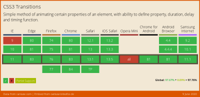
Vue.js is an open-source JavaScript framework for building client-facing web applications and single-page applications (SPA). One of the features of this framework is the ability to add transitions to an app seamlessly, to switch between either pages or components, and we’re going to look at how to do that in this tutorial.
Nuxt.js is also a JavaScript framework, built on top of Vue.js (and often referred to as a framework of a framework), for building server-side web applications, static-generated websites, as well as SPAs. It works the same as Vue.js, so if you know Vue.js, you shouldn’t have many issues getting started with Nuxt.js. Nuxt.js comes with two properties for adding transitions to an app, and we’re going to cover those as well in this tutorial.
This tutorial requires basic knowledge of either Vue.js or Nuxt.js. All of the code snippets in this tutorial can be found on GitHub.
What Is A Transition?
According to the Oxford Dictionary, a transition can be defined as:
“A passage in a piece of writing that smoothly connects two topics or sections to each other.
The process or a period of changing from one state or condition to another.”
In terms of physics, a transition is defined thus:
“A change of an atom, nucleus, electron, etc. from one quantum state to another, with emission or absorption of radiation.”
From these definitions, we get an idea on what a transition is. The definitions all involve two different things or states. In terms of code, a transition is not so different.
What Is A CSS Transition?
According to Mozilla’s web documentation:
“CSS Transitions is a module of CSS that lets you create gradual transitions between the values of specific CSS properties. The behavior of these transitions can be controlled by specifying their timing function, duration, and other attributes.”
This means we can define a CSS transition as: the change in the CSS property of one or more elements from one value to another.
The CSS transition property enables us to add a transition effect to any valid element. It consists of up to four other properties (five, if we count the transition property itself) that can be used individually or combined as a shorthand. Each property has a different function.
transition-property
The transition-property accepts the name of the CSS property that we want to watch out for changes on and whose change process we want to transition. It looks like this:
.btn {
  width: 200px;
  height: 50px;
  transition-property: width;
  background-color: red;
  color: #fff;
  border: 0;
}
But this property does not do anything without the next property.
transition-duration
The transition-duration property specifies the time that the change of the element(s) in the transition-property should go on for. This property is required in order for the transition to work. If it is not set (with a value greater than 0s), then the default value of 0s would mean it would not run. So, let’s set a duration for this transition:
.btn {
  width: 200px;
  transition-property: width;
  transition-duration: 2s;
  background-color: red;
  color: #fff;
  border: 0;
}
Here, we have an element with a class name of btn that has a width of 200px. We are using both the transition-property and the transition-duration properties here. What this means is, “Hey, CSS, watch out for when the width property changes, and when this happens, let the effect take 2s to change.”
So, if we have a button with a class name of btn, then the index.html file would look like this:
<!DOCTYPE html>
<html lang="en">
<head>
    <meta charset="UTF-8">
    <meta name="viewport" content="width=device-width, initial-scale=1.0">
    <title>CSS Transitions</title>
    <link rel="stylesheet" href="./assets/styles.css">
</head>
<body>
    <Section>
        <h1>Hi CSS Transitions</h1>
        <button class="btn">Hover on me to see a cool transition</button>
    </Section>
</body>
</html>
Here, we have an HTML file that contains a button with a class that has transition-property and transition-duration properties watching out for changes to the element’s width.
One thing to note is that, in order for the transition on our button to work, we have to actually change the width of that element, either by manually adjusting the width with the developer tools in the browser, by using one of the CSS pseudo-classes, or by using JavaScript. For the purpose of this tutorial, we’re going to use the CSS pseudo-class :hover to change the width of the button:
// existing styles
.btn:hover {
  width: 300px;
}
Now, if we hover over this button, we should see the width of the button gradually increase over the set time, which is 2s.
See the Pen
transition-property and transition-duration by Timi Omoyeni (@timibadass)
on CodePen.
transition-timing-function
The transition-timing-function property determines the speed at which the transition effect occurs. Five values are available for this property:
ease
This (the default) specifies a transition effect that starts slowly, then gets fast, then ends slowly.linear
This specifies a transition effect with the same speed from start to end.ease-in
This specifies a transition effect with a slow start.ease-out
This specifies a transition effect with a slow end.ease-in-out
This specifies a transition effect with a slow start and end.cubic-bezier(n,n,n,n)
This lets you define your own values in a cubic-bezier function.
So, if we add ease-in to our button, we should notice the speed at which the width and height change, compared to the speed at which the button returns to its normal state. Here is our updated styles.css sheet:
.btn {
  width: 200px;
  height: 50px;
  transition-property: width;
  transition-duration: 2s;
  transition-timing-function: ease-in;
  background-color: red;
  color: #fff;
  border: 0;
}
If we want a more dramatic speed effect or the freedom to set a specific speed effect, we can use cubic-bezier(n,n,n,n):
btn {
    width: 200px;
    height: 50px;
    transition-property: width;
    transition-duration: 2s;
    transition-timing-function: cubic-bezier(0.075, 0.82, 0.165, 1);
    background-color: red;
    color: #fff;
    border: 0;
}
See the Pen
transition-timing-function by Timi Omoyeni (@timibadass)
on CodePen.
One interesting thing about this value is that you can edit it directly in the browser using the developer tools.
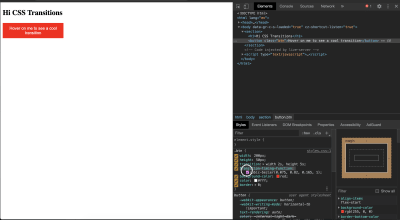
If you click on the highlighted part of your developer tools, you’ll get an interface to modify the cubic-bezier options:
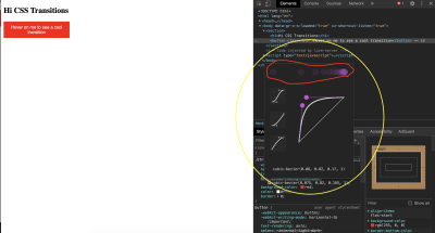
As you move the two points around, the values of (n,n,n,n) change, and you’ll see a representation (highlighted in red) of how the speed effect will appear. This can be very useful when you have a specific speed effect in mind.
transition-delay
The transition-delay property sets how long (in seconds) the transition has to wait before its effect starts to occur. This time is different from the transition-duration property, which specifies how long the transition effect will take place.
.btn {
  width: 200px;
  height: 50px;
  transition-property: width;
  transition-duration: 2s;
  transition-timing-function: cubic-bezier(0.075, 0.82, 0.165, 1);
  transition-delay: 5s;
  background-color: red;
  color: #fff;
  border: 0;
}
If you try this in the browser, you will notice a delay before the element’s width starts to change. This is because of the transition-delay property and value that we have set.
See the Pen
transition-delay by Timi Omoyeni (@timibadass)
on CodePen.
Shorthand Property
The individual transition properties can be tedious to use. For this reason, we have the shorthand property: transition. It accepts all of the properties in a defined order:
{
  transition: a b c d;
}
Here, the letters correspond as follows:
- a:
transition-property - b:
transition-duration - c:
transition-timing-function - d:
transition-delay
We can refactor our existing transition to work using this shorthand property:
// from
.btn {
  width: 200px;
  height: 50px;
  transition-property: width;
  transition-duration: 2s;
  transition-timing-function: cubic-bezier(0.075, 0.82, 0.165, 1);
  transition-delay: 1s;
  background-color: red;
  color: #fff;
  border: 0;
}

// to
.btn {
  width: 200px;
  height: 50px;
  transition: width 2s cubic-bezier(0.075, 0.82, 0.165, 1) 1s;
  background-color: red;
  color: #fff;
  border: 0;
}
If we try this code in the browser, we will get the same transition effect that we got when we used the individual properties.
See the Pen
using shorthand property by Timi Omoyeni (@timibadass)
on CodePen.
Transitions In Vue.js
Vue.js comes with two different ways to add transitions to an application. This doesn’t mean we cannot use transitions the CSS way. It just means that Vue.js’ developers have built on top of CSS to make it easier to use transitions. Let’s look at them one by one.
Transitioning Individual Elements and Components
One way we can use transitions in Vue.js is by wrapping the transition component around an element or component, using any of the following:
- conditional rendering ( using
v-if), - conditional display (using
v-show), - dynamic components,
- component root nodes.
When we are developing an application, there are instances when we want to display data to the user depending on a value (such as a boolean). Here’s an example of how this works, taken from the index.vue file:
<template>
  <div>
    <p v-if="show">Now you see me!</p>
    <p v-else>Now you don't!</p>
    <button @click="show = !show">click me</button>
  </div>
</template>
<script>
export default {
 data() {
   return {
     show: true
   }
 }
}
</script>
<style>
</style>
We have added two paragraphs to this page that appear depending on the value of show. We also have a button that changes the value of show when clicked. We’ll add this page to our App.vue file by importing it like so:
<template>
  <div id="app">
    <Index />
  </div>
</template>
<script>
import Index from "./components/index.vue";
export default {
  name: 'App',
  components: {
    Index
  }
}
</script>
If we open the browser, we should see our paragraph and button:

Right now, clicking the button changes only the value of show, which causes the visible text to change:

Adding a transition to this paragraph can be done by wrapping both paragraphs in the transition component. This component accepts a name prop, which is very important for the transition to work.
<template>
  <div>
    <transition name="fade">
      <p v-if="show">Now you see me!</p>
      <p v-else>Now you don't!</p>
    </transition>
    <button @click="show = !show">click me</button>
  </div>
</template>
This name tells Vue.js which transition to apply to the elements or components inside this transition component. At this point, if we click on the button, we would still not notice any transition because we have yet to add the configuration for our transition in the form of CSS classes.
One thing to note is that, when using a transition between two elements of the same tag, we need to specify a key attribute on each element in order for the transition to occur.
<template>
  <div>
    <transition name="fade">
      <p v-if="show" key="visible">Now you see me!</p>
      <p v-else key="notVisible">Now you don't!</p>
    </transition>
    <button @click="show = !show">click me</button>
  </div>
</template>
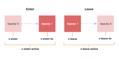
Vue.js has six transition classes that are applied to the elements or components inside the transition component, and each of these classes represents a state in the transition process. We’re going to look at only a few of them.
v-enter
The v-enter class represents the “starting state for enter”. This is the point at which a condition (v-if or v-else) has been met and the element is about to be made visible. At this point, the class has been added to the element, and it is removed once the element has been added. The name prop (in this case, fade) attached to the transition component is prefixed to this class name, but without the v. This v can be used by default if name is not provided. Thus, we can add this class to our index.vue file:
<style>
p {
  color: green;
}

.fade-enter{
  color: red;
  transform: translateY(20px);
}
</style>
First, we add a color of green to all of the paragraphs on the page. Then, we add our first transition class, fade-name. Inside this class, we change the color to red, and we make use of the transform and translateY property to move the paragraph by 20px along the y-axis (vertically). If we try clicking on the button again, we will notice that very little or no transition takes place during the switch because we need to add this next class we’ll look at.
v-enter-active
The v-enter-active class represents the “whole entering” state of a transitioning element. It means that this class is added just before the element is inserted or becomes visible, and it is removed when the transition has ended. This class is important for v-enter to work because it can be used to add the CSS transition property to the class, together with its properties (transition-property, transition-duration, transition-timing-function, and transition-delay), some of which are needed in order for the transition effect to work. Let’s add this class to our app and see what happens:
.fade-enter-active {
  transition: transform .3s cubic-bezier(1.0, 0.5, 0.8, 1.0), color .5s cubic-bezier(1.0, 0.5, 0.8, 1.0);
}
See the Pen
vue transition enter state by Timi Omoyeni (@timibadass)
on CodePen.
Now, if we click on the button, we will notice the transition of the color and the position of each of the texts as they come into view. But the transition from visible to hidden isn’t smooth enough because no transition is happening.
v-leave-active
The v-leave-active class represents the entire state in which an element changes from visible to hidden. This means that this class is applied from the moment an element starts to leave the page, and it is removed once the transition ends. This class is important in order for a leave transition to be applied because it takes in the CSS transition property, which also takes in other transition properties. Let’s add this to our app and see what happens:
.fade-leave-active {
  transition: transform 1s cubic-bezier(1.0, 0.5, 0.8, 1.0), color 1s cubic-bezier(1.0, 0.5, 0.8, 1.0);
}
See the Pen
vue transition leave active state by Timi Omoyeni (@timibadass)
on CodePen.
When we click on the button now, we will notice that the element that should leave waits for approximately 2 seconds before disappearing. This is because Vue.js is expecting the next class with this transition to be added in order for it to take effect.
v-leave-to
The v-leave-to transition represents the “leaving” state, meaning the point at which an element starts to leave and its transition is triggered. It is added one frame after a leaving transition is triggered, and removed when the transition or animation finishes. Let’s add this class to our app and see what happens:
.fade-leave-to {
  transform: translateX(100px);
  color: cyan;
}
Clicking on the button, we will notice that each element that is leaving is sliding to the right as the color changes.
See the Pen
vue transition leave to state by Timi Omoyeni (@timibadass)
on CodePen.
Now that we understand how transitions work in Vue.js, here’s an image that brings it all together:
Finally, notice the not-so-smooth transition that occurs during the enter and leave states of elements that are transitioning. This is because Vue.js’ transitions occur simultaneously. Vue.js has a mode prop that helps us achieve a very smooth transition process. This prop accepts one of the following values:
in-out
The new element transitions in first, and then, when it’s complete, the current element transitions out.out-in
The current element transitions out first, and then, when complete, the new element transitions in.
If we add this mode to our index.vue file and try again, we should see a better transition:
<template>
  <div>
    <transition name="fade" appear mode="out-in">
      <p v-if="show" key="visible">Now you see me!</p>
      <p v-else key="notVisible">Now you don't!</p>
    </transition>
    <button @click="transitionMe">click me</button>
  </div>
</template>
Now, if we click on the button, we will notice that one element leaves before another enters. This is a result of the mode we have selected for this transition. If we try the other mode, we will get a different behavior.
See the Pen
vue transition with mode by Timi Omoyeni (@timibadass)
on CodePen.
List Transitions
If you ever try adding transitions to more than one element at a time using the transition component, an error will get printed to the console:
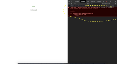
This is because the transition component is not meant to render more than one element at a time. If we want to transition two or more elements at a time or render a list (using v-for), we make use of the transition-group component. This component also accepts a name prop, but it has some differences from the transition component, including the following:
- A key attribute is required for each element inside this component.
- There is no need for the
modeprop because more than one element would be rendered at a time. - A
spanelement is rendered by default, but it can be modified by specifying atagprop when defining thetransition-groupcomponent. Let’s look at an example (in ourlistTransition.vuefile):
    <template>
  <div>
    <h1>List/Group Transition</h1>
    <ul>
      <li v-for="user in users" :key="user.id">
        {{user.name}}
        <button>Remove</button>
      </li>
    </ul>
  </div>
</template>
<script>
export default {
  data() {
    return {
      users: [
        {
          name: "Vuejs",
          id: 1
        },
        {
          name: "Vuex",
          id: 2
        },
        {
          name: "Router",
          id: 3
        }
      ]
    };
  }
};
</script>
<style>
</style>
Here, we have an array of users, which we loop through using v-for, displaying the name in our template section. In order to be able to view this list, we need to import this component into the App.vue page:
<template>
  <div id="app">
    <Index />
    <listTransition />
  </div>
</template>
<script>
import Index from "./components/index.vue";
import listTransition from "./components/listTransition.vue";
export default {
  name: "App",
  components: {
    Index,
    listTransition
  }
};
</script>
Note that when using the transition-group component, instead of wrapping our list with a ul tag (or any tag we have in mind), we wrap it around the transition-group component and add the tag to the tag prop, like this:
<template>
  <div>
    <h1>List/Group Transition</h1>
    <transition-group name="slide-fade" tag='ul'>
      <li v-for="user in users" :key="user.id">
        {{user.name}}
        <button>Remove</button>
      </li>
    </transition-group>
  </div>
</template>
<script>
export default {
  data() {
    return {
      users: [
        {
          name: "Vuejs",
          id: 1
        },
        {
          name: "Vuex",
          id: 2
        },
        {
          name: "Router",
          id: 3
        }
      ]
    };
  }
};
</script>
<style>
.slide-fade-enter-active {
  transition: transform 0.3s cubic-bezier(1, 0.5, 0.8, 1),
    color 0.5s cubic-bezier(1, 0.5, 0.8, 1);
}
.slide-fade-leave-active {
  transition: transform 1s cubic-bezier(1, 0.5, 0.8, 1),
    color 1s cubic-bezier(1, 0.5, 0.8, 1);
}
.slide-fade-enter {
  color: mediumblue;
  transform: translateY(20px);
}
.slide-fade-leave-to {
  transform: translateX(100px);
  color: cyan;
}
</style>
Here, we have replaced the ul tag with the transition-group component, and added the ul as the tag prop value. If we inspect the updated page in the developer tools, we will see that the list is being wrapped in the element that we specified in the tag prop (that is, ul).
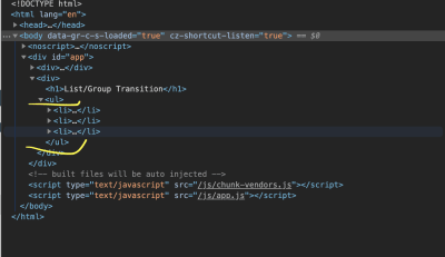
We have also added a transition name prop with a value of slide-fade to this component, with style rules below in the style section that follow this naming convention. For this to work, we need to add the following lines of code to our file:
<template>
  <div>
    <h1>List/Group Transition</h1>
    <transition-group name="slide-fade" tag="ul">
      <li v-for="user in users" :key="user.id">
        {{user.name}}
        <button @click="removeUser(user.id)">Remove</button>
      </li>
    </transition-group>
  </div>
</template>
<script>
export default {
  // ...
  methods: {
    removeUser(id) {
      let users = this.users.filter(user => user.id !== id);
      this.users = users;
    }
  }
};
</script>
In the template section, we add a click event to each button in the loop and pass the user.id to the removeUser method attached to this click event. We then create this function in the script section of our file. This function accepts an id as argument. Then, we run through our existing users and filter out the user with the id passed into this function. When this is done, we save our new array of users to the data of our page.
At this point, if you click on any of the buttons for the users, a transition effect will be applied as the user is being removed from the list.
See the Pen
Vue list transition by Timi Omoyeni (@timibadass)
on CodePen.
Transitions In Nuxt.js:
Adding transitions to a Nuxt.js application is quite different from how you might be used to in Vue.js. In Nuxt.js, the transition component is automatically added to the application for you. All you need to do is one of the following.
Add It to Individual Page Component
Nuxt.js allows us to add transitions to an individual page component seamlessly. This transition is applied while the user is navigating to this page. All we have to do is add a transition property to the script section of the component. This property can be a string, a function, or an object. Some of the properties it accepts are:
name,mode,css.
Like Vue.js, Nuxt.js has a default name that gets assigned to a transition class if no name is provided, and it is called page. Let’s see how this works when we add it to our application in transition.vue:
<template>
  <div>
    <p>
      Lorem ipsum dolor sit amet consectetur adipisicing elit. Labore libero
      odio, asperiores debitis harum ipsa neque cum nulla incidunt explicabo ut
      eaque placeat qui, quis voluptas. Aut necessitatibus aliquam veritatis.
    </p>
    <nuxt-link to="/">home</nuxt-link>
  </div>
</template>
<script>
export default {
  transition: {
    name: "fade",
    mode: "out-in"
  },
  data() {
    return {
      show: true
    };
  }
};
</script>
<style>
p {
  color: green;
}
.fade-enter-active {
  transition: transform 0.3s cubic-bezier(1, 0.5, 0.8, 1),
    color 0.5s cubic-bezier(1, 0.5, 0.8, 1);
}
.fade-leave-active {
  transition: transform 1s cubic-bezier(1, 0.5, 0.8, 1),
    color 1s cubic-bezier(1, 0.5, 0.8, 1);
}
.fade-enter {
  color: mediumblue;
  transform: translateY(20px);
}
.fade-leave-to {
  transform: translateX(100px);
  color: cyan;
}
</style>
On this page, we’ve displayed “lorem ipsum” in the template section. We’ve also added the transition property, to which we have passed an object whose name is set to fade and whose mode is set to out-in. Finally, in the style section, we’ve added some styles that control the transition as the user navigates between this page and another.
In order for this transition to work, we have to navigate to /transition, but we would not notice any transition if we manually enter this route in our browser. So, let’s add a link to this page on the index.vue page.
<template>
  <div class="container">
    <div>
      // ..
      <nuxt-link to="/transition">next page</nuxt-link>
    </div>
  </div>
</template>
Now, if we click the link on either of the two pages, we will notice a sliding transition as the browser moves to and from the /transition route.
pageTransition
Adding transitions to individual pages can be challenging if we want to add them to all of the pages in the application. That’s where pageTransition comes in. This property allows us to add a general configuration for all of our pages in the nuxt.config.js file. This property accepts both a string and object as an option. Let’s see how that works in nuxt.config.js:
export default {
    // ...
    /*
     ** Global CSS
     */
    css: [
        '~/assets/transition.css'
    ],
    pageTransition: {
        name: "fade",
        mode: "out-in"
    },
}
Here, we’ve added the link to a CSS file, which we’ll create shortly. We have also added the pageTransition property to the file, along with with its configuration. Now, let’s create our CSS file, transition.css, and add the following styles to it:
.fade-enter-active {
    transition: transform 0.3s cubic-bezier(1, 0.5, 0.8, 1), color 0.5s cubic-bezier(1, 0.5, 0.8, 1);
}
.fade-leave-active {
    transition: transform 1s cubic-bezier(1, 1, 1, 1), color 1s cubic-bezier(1, 0.5, 0.8, 1);
}
.fade-enter {
    color: mediumblue;
    transform: translateY(20px);
}
.fade-leave-to {
    transform: translate3d(-500px, -300px 400px);
    color: cyan;
}
We’ve added the classes and styles that will be applied to the transition between one route and the other. If we get rid of the transition configuration from the transition.vue page and try to navigate between the two pages, we will get a transition effect.
layoutTransition
The layoutTransition property enables us to apply transitions based on the layout that the page is on. It works the same way as pageTranslation, except that it works based on layout. The default transition name is layout. Here’s an example of how it works, in nuxt.config.js:
export default {
    // ...
    /*
     ** Global CSS
     */
    css: [
        '~/assets/transition.css'
    ],
    layoutTransition: {
        name: "fade",
        mode: "out-in"
    },
}
Note that fade has to be the name of the layout in order for the transition to work with its layout. Let’s create this new layout in newLayout.vue to see what I mean:
<template>
  <!-- Your template -->
  <div>
    <h1>new layout</h1>
  </div>
</template>
<script>
export default {
  layout: "blog"
  // page component definitions
};
</script>
Conclusion
We have learned about CSS transitions and how to create them using the transition properties individually (transition-property, transition-duration, transition-timing-function, and transition-delay) and using the shorthand transition property. We have also covered how to apply these transitions in both Vue.js and Nuxt.js. But that’s not all. Vue.js has more ways for us to apply transitions in an application:
- “CSS Animations”, Vue.js
- “Transitioning Between Components”, Vue.js
- “State Transitions”, Vue.js
Related Resources
- “CSS Transitions”, MDN Web Docs
- “transition” (definition), Lexico
- “CSS Transitions”, W3Schools
- “Enter/Leave and List Transitions”, Vue.js
- Enter/Leave graphic, Vue.js
- “API: The Page
transitionProperty”, Nuxt.js - “API: transition Properties”, Nuxt.js
- “Page and Layout Transitions in Nuxt.js”, Debbie O’Brien, DEV
(ks, ra, yk, il)
From our sponsors: CSS Transitions In Vuejs And Nuxtjs


