Archived
Breaking Boxes With CSS Fragmentation


Breaking Boxes With CSS Fragmentation
Breaking Boxes With CSS Fragmentation
Rachel Andrew
2019-02-27T14:00:00+01:00
2019-02-28T11:16:15+00:00
In this article, I’m going to introduce you to the CSS Fragmentation specification. You might never have heard of it, however, if you have ever created a print stylesheet and wanted to control where the content breaks between pages, or multi-column layout and wanted to stop a figure breaking between columns, you have encountered it.
I find that quite often problems people report with multicol are really problems with browser support of fragmentation. After a quick rundown of the properties contained in this specification, I’ll be explaining the current state of browser support and some of the things you can do to get it working as well as it can in your multicol and print projects.
What Is Fragmentation?
Fragmentation in CSS describes the process by which content becomes broken up into different boxes. Currently, we have two places in which we might run into fragmentation on the web: when we print a document, and if we use multi-column layout. These two things are essentially the same. When you print (or save to PDF) a webpage, the content is fragmented into as many pages as are required to print your content.
When you use multicol, the content is fragmented into columns. Each column box is like a page in the paged context. If you think of a set of columns as being much like a set of pages it can be a helpful way to think about multicol and how fragmentation works in it.
If you take a look at the CSS Fragmentation Specification you will see a third fragmented context mentioned — that context is Regions. As there are no current usable implementations of Regions, we won’t be dealing with that in this article, but instead looking at the two contexts that you might come across in your work.
Up, up to the stars! For our second SmashingConf Toronto  , we’ll explore the bright and dark sides of front-end and UX — CSS Grid, service workers, cross-cultural design, performance and CSS/JavaScript techniques. Instead of showing slides, presenters will show how they actually work, from live debugging to live redesign. June 25–26.
All speakers & topics ↬
Block And Inline Boxes
I am going to mention block boxes a lot in this article. Every element of your page has a box. Some of those boxes are laid out as blocks: paragraphs, list items, headings. These are said to be participating in a block formatting context. Others are inline such as the words in a paragraph, spans and anchor elements. These participate in an inline formatting context. Put simply, when I refer to a block box, I’m talking about boxes around things like paragraphs. When dealing with fragmentation, it is important to know which kind of box you are dealing with.
For more information on block and inline layout, see the MDN article “Block And Inline Layout In Normal Flow”. It is one of those things that we probably all understand on some level but might not have encountered the terminology of before.
Controlling Breaks
Whether you are creating a print stylesheet, using a specific print user agent to make a PDF,or using multicol, you will sometimes run into problems that look like this.
In the below multicol example, I have some content which I am displaying as three columns. In the middle of the content is a boxed out area, which is being broken across two columns. I don’t want this behavior — I would like the box to stay together.
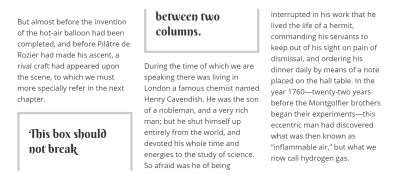
The box breaks across two columns (Large preview)
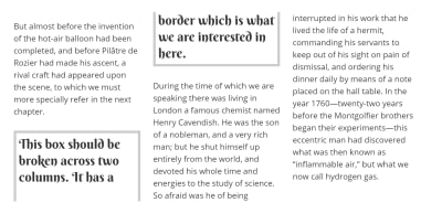
To fix this, I add the property break-inside: avoid to the box. The break-inside property controls breaks inside elements when they are in a fragmented context. In a browser which supports this property, the box will now stay in one of the columns. The columns will look less well balanced, however, that is generally a better thing than ending up with the boxout split across columns.
See the Pen Simple break-inside example by (Rachel Andrew.
The break-inside property is one of the properties detailed in the fragmentation spec. The full list of properties is as follows:
break-beforebreak-afterbreak-insideorphanswidowsbox-decoration-break
Let’s have a look at how these are supposed to work before we move onto what actually happens in browsers.
The break-before And break-after Properties
There are two properties that control breaks between block-level boxes: break-before and break-after. If you have an h2 followed by two paragraphs
you have three block boxes and you would use these properties to control the breaks between the heading and first paragraph, or between the two paragraphs.
The properties are used on selectors which target the element you want to break before or after.
For example, you might want your print stylesheet to break onto a new page every time there is a level 2 heading. In this case, you would use break-before: page on the h2 element. This controls the fragmentation and ensures there is always a break before the box of the h2 element.
h2 {
    break-before: page;
}
Another common requirement is to prevent headings ending up as the last thing on a page or column. In this case, you might use break-after with a value of avoid. This should prevent a break directly after the box of the element:
h1, h2, h3, h4 {
    break-after: avoid;
}
Fragments Within Fragments
It is possible that you might have an element that is fragmented nested inside another. For example, having a multicol inside something which is paged. In that case, you might want to control breaks for pages but not for columns, or the other way around. This is why we have values such as page which would always force a break before or after the element but only when the fragment is a page. Or avoid-page which would avoid a break before or after the element only for paged contexts.
The same applies to columns. If you use the value column, this would always force a break before or after that element, but only for multicol contexts. The value avoid-column would prevent a break in multicol contexts.
There is an always value in the Level 4 specification which indicates that you want to break through everything – page or column. However, as a recent addition to the spec it is not currently useful to us.
Additional Values For Paged Media
If you are creating a book or magazine, you have left and right pages. You might want to control breaking in order to force something onto the left or right page of a spread. Therefore, using the following would insert one or two-page breaks before the h2 to ensure it was formatted as a right page.
h2 {
    break-before: right;
}
There are also recto and verso values which relate to page progression as books written in a vertical or right to left language have a different page progression than books written in English. I’m not going to cover these values further in this article as I’m primarily concerned with what is possible from the browser this time.
break-inside
We have already seen an example of the break-inside property. This property controls breaking inside block boxes, e.g. inside a paragraph, heading or a div.
Things that you may not want to break can include a boxout as described above: figures where you do not want the caption detached from the image, tables, lists and so on. Add break-inside: avoid to any container you don’t wish to break in any fragmentation context. If you only wish to avoid breaks between columns use break-inside: avoid-column and between pages break-inside: avoid-page.
The orphans And widows Properties
The orphans and widows properties deal with how many lines should be left before or after a break (either caused by a column or a new page). For example, if I want to avoid a single line being left at the end of a column, I would use the orphans property, as in typography, an orphan is the first line of a paragraph that appears alone at the bottom of a page with the rest of the paragraph broken onto another page. The property should be added to the same element which is fragmenting (in our case, the multicol container).
.container {
    column-count: 3;
    orphans: 2;
}
To control how many lines should be at the top of a column or page after a break, use widows:
.container {
    column-count: 3;
    widows: 2;
}
These properties deal with breaks between inline boxes such as the lines of words inside a paragraph. Therefore, they don’t help in the situation where a heading or other block element is alone at the bottom of a column or page, you need the break properties discussed above for that.
Box Decoration
A final property that may be of interest is the box-decoration-break property. This controls the situation where you have a box with a border broken between two column boxes or pages. Do you want the border to essentially be sliced in half? Or do you want each of the two halves of the box to be wrapped fully in a border?
The first scenario is the default, and is as if you set the box-decoration-break property to slice on the box.
.box {
    box-decoration-break: slice;
}
A value of slice means the border is effectively sliced in half (Large preview)
To get the second behavior, set box-decoration-break to clone.
.box {
    box-decoration-break: clone;
}
A value of clone means the border is wrapped fully round each fragment of the box (Large preview)
Browser Support For Fragmentation
Now we come to the reason I don’t have a bunch of CodePen examples above to demo all of this to you, and the main reason for my writing this article. Browser support for these properties is not great.
If you are working in Paged Media with a specific user agent such as Prince, then you can enjoy really good support for fragmentation, and will probably find these properties very useful. If you are working with a web browser, either in multicol, creating print stylesheets, or using something like Headless Chrome to generate PDFs, support is somewhat patchy. You’ll find that the browser with the best support is Edge — until it moves to Chromium anyway!
Can I Use isn’t overly helpful with explaining support due to mixing the fragmentation properties in with multicol, then having some separate data for legacy properties. So, as part of the work I’ve been doing for MDN to document the properties and their support, I began testing the actual browser support. What follows is some advice based on that testing.
Legacy And Vendor Prefixed Properties
I can’t go much further without a history lesson. If you find you really need support for fragmentation then you may find some relief in the legacy properties which were originally part of CSS2 (or in some prefixed properties that exist).
In CSS2, there were properties to control page breaking. Multicol didn’t exist at that point, so the only fragmented context was a paged one. This meant that three specific page breaking properties were introduced:
page-break-beforepage-break-afterpage-break-inside
These work in a similar way to the more generic properties without the page- prefix, controlling breaks before, after and inside boxes. For print stylesheets, you will find that some older browsers which do not support the new break- properties, do support these page prefixed properties. The properties are being treated as aliases for the new properties.
In a 2005 Working Draft of the multicol specification are details of breaking properties for multicol — using properties prefixed with column- (i.e. column-break-before, column-break-after, and column-break-inside). By 2009, these had gone, and a draft was in the multicol specification for unprefixed break properties which eventually made their way into the CSS Fragmentation specification.
However, some vendor prefixed column-specific properties were implemented based on these properties. These are:
-webkit-column-break-before-webkit-column-break-after-webkit-column-break-inside
Support For Fragmentation In Multicol
The following is based on testing these features in multicol contexts. I’ve tried to explain what is possible, but do take a look at the CodePens in whichever browsers you have available.
Multicol And break-inside
Support in multicol is best for the break-inside property. Up to date versions of Chrome, Firefox, Edge, and Safari all support break-inside: avoid. So you should find that you can prevent boxes from breaking between columns when using multicol.
Several browsers, with the exception of Firefox, support the -webkit-column-break-inside property, this can be used with a value of avoid and may prevent boxes breaking between columns which do not have support for break-inside.
Firefox supports page-break-inside: avoid in multicol. Therefore, using this property will prevent breaks inside boxes in Firefox browsers prior to Firefox 65.
This means that if you want to prevent breaks between boxes in multicol, using the following CSS will cover as many browsers as possible, going back as far as possible.
.box {
    -webkit-column-break-inside: avoid;
    page-break-inside: avoid;
    break-inside: avoid;
}
As for the column value, explicitly stating that you only want to avoid breaks between columns, and not pages, works in all browsers except Firefox.
The below CodePen rounds up some of these tests in multicol so you can try them for yourself.
See the Pen Multicol Fragmentation Test: break-inside by Rachel Andrew.
Multicol And break-before
In order to prevent breaks before an element, you should be able to use break-before: avoid or break-before: avoid-column. The avoid property has no browser support.
Edge supports break-before: column to always force a break before the box of the element.
Safari, Chrome and Edge also support -webkit-column-break-before: always which will force a break before the box of the element. Therefore, if you want to force a break before the box of an element, you should use:
.box {
    -webkit-column-break-before: always;
    break-before: column;
}
Preventing a break before the box is currently an impossible task. You can play around with some examples of these properties below:
See the Pen Multicol Fragmentation Test: break-before by Rachel Andrew).
Multicol And break-after
To prevent breaks after an element, to avoid it becoming the last thing at the bottom of a column, you should be able to use break-after: avoid and break-after: avoid-column. The only browser with support for these is Edge.
Edge also supports forcing breaks after an element by using break-after: column, Chrome supports break-after: column and also -webkit-column-break-after: always.
Firefox does not support break-after or any of the prefixed properties to force or allow breaks after a box.
Therefore, other than Edge, you cannot really avoid breaks after a box. If you want to force them, you will get results in some browsers by using the following CSS:
.box {
    -webkit-break-after: always;
    break-after: column;
}
See the Pen Multicol Fragmentation Test: break-after by Rachel Andrew).
Support When Printing From The Browser
Whether you print directly from your desktop browser or generate PDF files using headless Chrome or some other solution reliant on browser technology doesn’t make any difference. You are reliant on the browser support for the fragmentation properties.
If you create a print stylesheet you will find similar support for the break properties as for multicol, however, to support older browsers you should double up the properties to use the page- prefixed properties.
Print Stylesheets And break-inside
In modern browsers ,the break-inside property can be used to prevent breaks inside boxes, add the page-break-inside property to add support for older browsers.
.box {
    page-break-inside: avoid;
    break-inside: avoid;
}
Print Stylesheets And break-before
To force breaks before a box use break-before:page along with page-break-before: always.
.box {
    page-break-before: always;
    break-before: page;
}
To avoid breaks before a box use break-before: avoid-page along with page-break-before: avoid.
.box {
    page-break-before: avoid;
    break-before: avoid-page;
}
There is better support for the page and avoid-page values than we see for the equivalent multicol values. The majority of modern browsers have support.
Print Stylesheets And break-before
To force breaks after a box, use break-after: page along with page-break-after: always.
.box {
    page-break-after: always;
    break-after: page;
}
To prevent breaks after a box use break-after: avoid-page along with page-break-after: avoid.
.box {
    page-break-after: avoid;
    break-after: avoid-page;
}
Widows And Orphans
The widows and orphans properties enjoy good cross-browser support — the only browser without an implementation being Firefox. I would suggest using these when creating a multicol layout or print stylesheet. If they don’t work for some reason, you will get widows and orphans, which isn’t ideal but also isn’t a disaster. If they do work your typography will look all the better for it.
box-decoration-break
The final property of box-decoration-break has support for multicol and print in Firefox. Safari, Chrome and other Chromium-based browsers support -webkit-box-decoration-break, but only on inline elements. So you can clone borders round lines of a sentence for example; they do not have support in the context we are looking at.
In the CodePen below, you can see that testing for -webkit-box-decoration-break: clone with Feature Queries returns true, however, the property has no effect on the border of the box in the multicol context.
See the Pen Multicol: box-decoration-break by Rachel Andrew.
Using Fragmentation
As you can see, the current state of fragmentation in browsers is somewhat fragmented! That said, there is a reasonable amount you can achieve and where it fails, the result tends to be suboptimal but not a disaster. Which means it is worth trying.
It is worth noting that being too heavy handed with these properties could result in something other than what you hoped for. If you are working on the web rather than print and force column breaks after every paragraph, then end up with more paragraphs than space for columns, multicol will end up overflowing in the inline direction. It will run out of columns to place your additional paragraphs. Therefore, even where there is support, you still need to test carefully, and remember that less is more in a lot of cases.
More Resources
To read more about the properties head over to MDN, I’ve recently updated the pages there and am also trying to keep the browser compat data up to date. The main page for CSS Fragmentation links to the individual property pages which have further examples, browser compat data and other information about using these properties.
(il)
From our sponsors: Breaking Boxes With CSS Fragmentation


