A Practical Guide To SVG And Design Tools
A Practical Guide To SVG And Design Tools
A Practical Guide To SVG And Design Tools
Mikołaj Dobrucki
2019-05-03T14:00:59+02:00
2019-05-03T12:34:43+00:00
A good understanding of SVG is a rare skill. Surprisingly often, SVG is treated as just another image format. We use SVG because of its scalability and smaller file size, but in reality, SVG is so much more!
In this article, I’ll shed light on three of the most popular design tools: Adobe Illustrator, Sketch, and Figma. There are also other tools available supporting SVG that may have other functionalities and implement other solutions.
Note: If not stated otherwise, the content of this article is referring to SVG 1.1 2nd Edition. Some of the points discussed below would not apply to SVG 2, however, it still hasn’t reached the recommendation status, leaving SVG 1.1 as the most up-to-date specification.
Why Bother About Design Tools?
SVG is an XML-based markup language and, like any other programming language, can be written and edited in a text editor. So theoretically, as opposed to JPG or PNG files, we don’t need any GUI software to create SVG. However, in a vast majority of cases, using graphic design applications is inevitable.
Working with complicated shapes and graphics in a text-based format is utterly possible, but usually would be very tricky and tedious. Therefore, it’s common practice to use applications such as Adobe Illustrator, Sketch or Figma to design graphics visually, and then export them to an SVG format.
So no matter if you’re a designer that codes or a design-conscious developer, a good proficiency in working with SVG requires a bit of knowledge from both sides: design tools and the SVG language itself. To better understand the relation between the two, let’s take a closer look at what graphic design apps have to offer and how their features translate to SVG.
Basic Shapes
Many vector graphics are build out of a few basic shapes — grouped, transformed and combined with each other. The table below represents what shape tools are available in Illustrator, Sketch, and Figma and what SVG elements they are exported as.
Illustrator
Sketch
Figma
Generated SVG
Ellipse Tool
Oval
Ellipse
or
Rectangle Tool
Rectangle
Rectangle
Rounded Rectangle Tool
Rounded
–
Line Segment Tool
Line
Line
(Illustrator and Figma) (Sketch)
–
Arrow
Arrow
Polygon Tool
Polygon
Polygon
(Illustrator and Sketch) (Figma)
Star Tool
Star
Star
(Illustrator and Sketch) (Figma)
–
Triangle
–
Ellipses And Circles
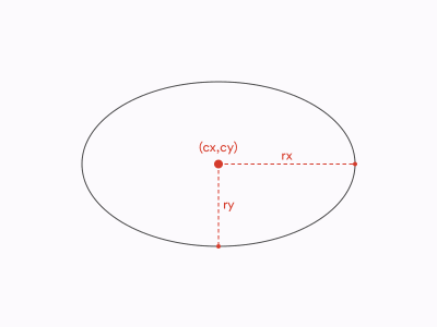
One of the basic shapes in every design tool is an ellipse. In SVG, we will find a matching element, defined by the coordinates of the ellipse’s centre (cx and cy) and two radii (rx and ry).
This is what an ellipse looks like in SVG:
<ellipse cx="400" cy="300" rx="250" ry="150"/> 
SVG ellipse (Large preview)
The very special type of ellipse is a circle. A circle is an ellipse with rx and ry radii equal to each other. SVG has its own element that takes one attribute less as there’s only one radius to be taken into account:
<circle cx="400" cy="300" r="250"/> 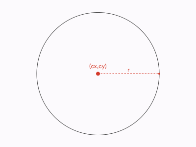
SVG circle (Large preview)
In case of ellipses and circles, all design tools work the same: Ellipse Tool in Illustrator, Oval tool in Sketch and Ellipse tool in Figma will all generate element unless the radii are equal: in such cases we will end up with a element.
Rectangles And Rounded Rectangles
Another basic shape common to all design tools is a rectangle. In case of all design tools, using a rectangle tool generates a element in SVG. A basic is defined by 4 attributes: its x and y coordinates, along with its width and height:
<rect x="150" y="100" width="500" height="400"/> 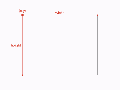
SVG rectangle (Large preview)
Notice that while ‘s and ‘s position is defined by their geometrical centers, the position of a is defined by the coordinates of its top left corner.
Apart from basic rectangles, we often use rectangles with rounded corners. In all three design tools, you can turn a rectangle into a rounded rectangle by applying a border radius to it in the Inspector or the Properties panel.
Additionally, in Sketch and Illustrator, there are tools dedicated to creating rounded rectangles (Rounded Rectangle Tool in Illustrator and Rounded tool in Sketch). However, there’s no difference between a regular rectangle with a radius applied and a rounded rectangle drawn with a Rounded Rectangle tool.
Therefore, no matter how created, a rounded rectangle will be exported using the following syntax:
<rect x="150" y="100" width="500" height="400" rx="30"/>In this case, rx is an attribute responsible for the radius of the rounded corners:
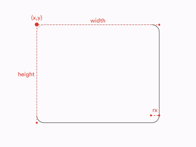
SVG rounded rectangle (Large preview)
Rounded Rectangles With Elliptical Corners
One significant difference between design tools and SVG is how radii are defined. In all the design tools we consider, border radius is defined by a single variable. We can think of border radii as little circles used to mask the corners of our rectangles:

Rounded corner in SVG (Large preview)
Meanwhile, in SVG border radii can be defined by two attributes: rx (as in the example above) and ry. They allow us to create rectangles with elliptical corners. You can think of such rounded corners as ellipses used as masks instead of circles:
<rect x="150" y="100" width="500" height="400" rx="40" ry="30"/> 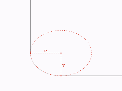
Elliptical corner in SVG (Large preview)
So, in this case, SVG offers you more possibilities than design tools.
Note: Even though it’s not exactly related to the topic of this article, it’s worth noting that the difference described above applies to both SVG and HTML/CSS. The CSS property border-radius that is used to style nodes such as divs and spans also allows creating elliptical corners. You can see an example below.
border-radius: 10px 5% / 20px 25em 30px 35em;Values before the slash (/) are horizontal radii (equivalent of rx) and values after the slash are vertical values (equivalent of ry).
Rounded Rectangles With Multiple Radii
In design tools, the same as in CSS, each of the corners of a rectangle can be controlled separately. In other words, each corner can have its own radius (or no radius altogether). Such operation is not possible on a element in SVG. Each element has only one rx and one ry attribute. If you create a rectangle with multiple radii applied to its corners, the design tool will generate a element instead of a element. We will talk more of a element in the next section.
Smooth Corners
One of the interesting features introduced by Sketch and Figma not that long ago is smooth corners. In short, smooth corners use an irregular border-radius to achieve a result that looks more natural and, well, smooth. The most common application of smooth corners is app icons and other rounded elements on iOS. Apple used “regular” rounded corners on its mobile platform until iOS6 and then switched to what we call today “smooth” corners as a part of the big redesign introduced in 2013 (iOS7).

Difference between rounded and smooth corners (Large preview)
In Sketch, you can achieve smooth corners effect by switching between Round Corners and Smooth Corners in Inspector. Figma is giving you even more control over your corners as you can manipulate with the level of smoothness in the Corner Smoothing menu.
Unfortunately, none of these can be easily translated to SVG as SVG doesn’t know the concept of smooth corners at all. There’s also an important difference between what Sketch and Figma do if you try to export a rectangle with smooth corners to SVG.
Figma ignores the smooth corners, and exports a rectangle as a regular element with rounded corners. Sketch, on the other hand, exports a rectangle with smooth corners as a that is trying to replicate the true shape of smooth corners. So Figma gives us worse accuracy for the sake of keeping a rectangle a rectangle, while Sketch is aiming at maximum possible accuracy at the cost of semantics and bigger file size. If you’d like to understand better what does this difference mean, we will dig deeper into the pros and cons of preserving basic shapes a bit later.
Lines
The next basic type of element is a line. In this case, we refer to a line as a single straight line going from point A to point B.
Illustrator, Sketch and Figma all offer their own line tools dedicated to drawing lines.
In SVG, we have a element. Four of its attributes are required: the coordinates of its starting point and the coordinates of its end point:
<line x1="100" y1="100" x2="200" y2="200"/> 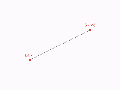
SVG line (Large preview)
When it comes to exporting, Illustrator and Figma will export lines as elements where possible, while Sketch will always compute lines to elements.
Polylines
Now let’s take a look at polylines. Polyline is a connected series of straight lines. Polylines don’t have dedicated tools in the design tools. They can be drawn with a Pen tool (in Illustrator and Figma) or with a Vector tool (in Sketch).
In, SVG, polylines are defined with a element. is drawn using a points attribute which is a list of coordinates defining all the points that create a polyline. Let’s take a look at an example of a polyline made out of three segments and four points:
<polyline points="10,20 10,20 30,10 40,20" /> 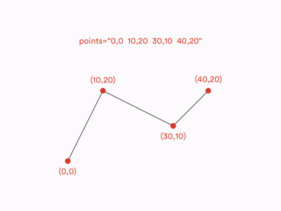
(Large preview)
Illustrator and Sketch translate polylines to elements, whilst Figma exports polylines as s.
Arrows
In all three tools, you can control the ends of the lines to turn them into arrows and such. And all three tools will export such lines as s, even if without the caps applied the same shapes would be translated to s or s. Is it because SVG doesn’t support arrows? Not exactly.
Actually, SVG specification does include customizable line ends which are known as markers. However, none of the design tools we mentioned use markers in the SVG they generate.
is a separate SVG element that can be defined within SVG’s and then used on , and elements with marker attributes: marker, marker-start, marker-mid and marker-end. If you’d like to learn more about these attributes, I would recommend you to check out the official W3C documentation.
Polygons And Stars
The last basic shape we’ll take a look at it is a polygon. Polygon is a closed shape made of straight lines, e.g. star or a hexagon. You can also think of it as of a closed polyline. The syntax of a element in SVG is actually the same as of a . The only difference between the two is that in the the last point on the list is always being connected with the first point to make a a closed shape.
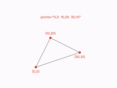
SVG polygon (Large preview)
Some polygons are regular polygons. What is special about regular polygons is that all of their sides and angles are equal. To draw regular polygons, such as a hexagon or a pentagon, you can use a Polygon tool, same in Illustrator, Sketch and Figma. Polygon tools in Illustrator and Sketch will generate elements in SVG. In Figma, on the other hand, all shapes made with a Polygon tool result in elements.
All three design tools also have dedicated Star tools to draw stars. However, when it comes to export, shapes created with Star tools behave exactly the same as those created with Polygon tools. In SVG, stars are just polygons, there is NO ~~~~ element.
It’s important to remember that Star and Polygon tools are used to create regular stars and polygons, while the element in SVG can be used for any polygon, regular or irregular.
All Roads Lead To
As we already learned, in SVG, there are three basic shapes dedicated to drawing shapes made out of straight lines: , and . But what if we’d like our lines to be curved? It’s a high time we spoke about the element.
The
is the most versatile SVG element. It can be used to draw any possible line and shape, including, but not limited to, all the basic shapes listed above. In fact, every basic shape (, , , , , ) can be described as a element. What is more, there are many shapes that can be created with but are not possible to create with any other SVG element. To learn more about and its syntax, I would recommend you to check out this excellent article by Chris Coyier.
Now, how do we create elements in design tools? First of all, as we learned above, some of the layers created with shape tools compute to elements even though they theoretically could be other elements (e.g. Figma exports all polygons as s even though they could have been defined as s. Then, every other irregular shape we draw with a Pen tool or a Vector tool must be exported as as there’s no other SVG element that could define them. Finally, in Sketch and Figma, we can convert any basic shape into a layer that computes to a . In Sketch, we can accomplish this by choosing Layer > Combine > Flatten, while is Figma we can find this function under Object > Flatten Selection (⌘ + E on macOS, Ctrl + E on Windows).
Boolean Operations
Boolean operations are functions performed on shapes to combine them in a few different ways. In Illustrator, Sketch and Figma, there are 4 standard boolean operations:
- Union (Unite)
A sum of the shapes - Subtract (Minus front)
Bottom shape subtracted by the common area between the shapes - Intersect
The common area between the shapes - Difference (Exclude)
A sum of the shapes subtracted by the common area between the shapes.
In Illustrator, all of these functions generate a single shape (outline). It is an action that cannot be reversed — otherwise than using Undo (⌘ + Z on macOS, Ctrl + Z on Windows). In Sketch and Figma, on the other hand, boolean operations create layer groups that can be ungrouped later on without any harm caused to the shapes inside. However, you can merge these groups into a single shape to achieve a similar result as in Illustrator using Flatten functions mentioned in the previous paragraph.
The question is, does SVG support boolean operations? No, it doesn’t. They just get merged. Therefore, every combined shape you create with boolean operations in Figma or Sketch will be exported as a single element.
It Looks The Same, So Why Does It Matter?
In terms of how different shapes can be defined in SVG, its syntax is extremely versatile. Let’s consider a basic rectangle:

Nothing more than a rectangle (Large preview)
Such a shape can be defined in SVG in a few different ways. It can be a element, a element. It definitely can be a element (as everything can be a element). It can also be a element (or a element) if we decide to create it using strokes instead of fills.
Each of these elements renders a rectangle that looks exactly the same:
rectangle
polygon
line
path
e.g. or
But, if the final result (the graphic rendered by a user agent in a browser) looks the same, does it really matter what approach do we choose? Well, it does. As a rule of a thumb, I would always recommend using basic shapes where possible.
Last but not least, use the most obvious shapes for the given case. For example, don’t create rectangles with lines or circles with rectangles if you don’t have a good reason. There are at least a few arguments behind that:
Compression tools, such as SVGO, give you an option to compute all the basic shapes to path elements. It can save you a few bites but will definitely lower the readability of your code.
Compressing shapes to paths may help you minify files but it’s not always the case! For example, a rounded rectangle takes much more space as a
Have you ever tried to animate SVG? It’s a lot of fun — as long as you operate on clean, semantic SVG. With basic shapes, you can easily manipulate such parameters as radius, width, height or position of the point. If you merge your shapes into paths, most of those operations will be much harder to achieve or simply impossible.
Remember that SVG is not a static image such as JPG. You can style it, theme it, make it responsive, and so on. Same as with animations, keeping your file well-structured and semantic will definitely help you with any of those tasks.
As with every rule, you can find some exceptions. But, on a general basis, it’s good practice to keep your SVG as readable, flexible and structured as possible.
Now, let’s take a look at other attributes and features such as viewBox, groups, transforms and visual effects.
width, height and viewBox
If you already have some experience with SVG, you probably noticed that the opening tag often has the following attributes: width, height and viewBox. In design tools, we have dimensions of artboards (or frames in case of Figma). So how exactly these values are related to each other?
Let’s start with explaining the attributes we just mentioned. You can think of a viewBox as of a virtual canvas in the form of a coordinate system. The centre of this coordinate system is placed in the top left corner of the designated area. All items within the tag are placed according to this coordinate system and also clipped by it — anything that overflows the viewBox won’t be rendered. viewBox accepts 4 numbers as its value:
<svg viewBox="0 0 12 8"> … </svg> 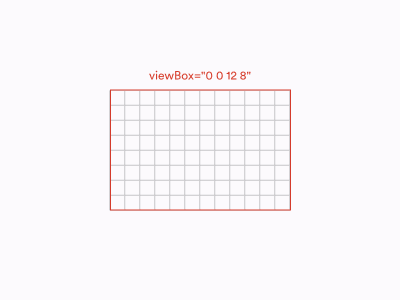
viewBox model in SVG (Large preview)
As SVG stands for Scalable Vector Graphics, no units are needed on these numbers. Just imagine it as an abstract coordinate system that can be scaled up and down to any size. Don’t worry too much about the first two numbers, most likely you won’t need them. The latter two are what usually matters. These are the actual dimensions of our SVG canvas.
viewBox doesn’t determine SVG’s size. It just specifies the coordinates of the area in which our SVG is drawn. Therefore, when used on the web, with a specified viewBox will always take all the available space and preserve the ratio set by the viewBox — unless we prevent this with CSS or set the width and/or height attributes.
width and height are the attributes that set the actual width and height of the SVG element. On the contrary to viewBox, they should use specified units such as pixels, ems or rems. This means that we can also transform the SVG with them — if the ratio between the width and height is different than the ratio between the values of the viewBox, SVG will skew the graphic specified within the viewBox according to the width and height values:
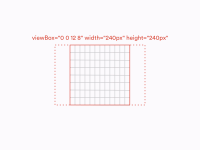
viewBox‘s aspect ratio is 3:2 but its width and height attributes make it display as a square. (Large preview)
Now, what happens when we export SVG from design tools? In Sketch and Figma, all assets (no matter if they’re single layers, groups or artboards) will always get a viewBox equal to the dimensions of the exported element and width and height set in pixels, equal to the last two values of the viewBox. In Illustrator, all assets have a viewBox, specified the same way as in Sketch and Figma, but no width and height applied.
Groups
Groups are the basic mean of organizing layers in design tools. Apart from setting hierarchy, groups are used to apply bulk operations, such as transforms, to multiple elements. There’s no significant difference in how groups work across Illustrator, Sketch and Figma and, fortunately, the basic functionality of SVG groups (…) is pretty much the same.
Transforms
In SVG, there are five basic transforms that we can apply to an element:
translate: moves the element along the vertical and/or horizontal axis;scale: scales the element along the vertical and/or horizontal axis:rotate: creates a two-dimensional rotation by a given angle specified in degrees around a given point;skew (skewX or skewY): skews the element by a given angle specified in degrees along the vertical or horizontal axis;matrix: the most complex and versatile of available transform functions. As it would require quite a lot of algebra talk to explain how matrix transformations work, it goes far beyond the scope of this article. Let’s just acknowledge that matrix allows you to perform many complicated transforms such as stretching, squeezing, shearing, and so on.Note: Notice that even though some of the SVG transforms look very similar to CSS transforms, they are not the same. For example, CSS offers both 2D and 3D rotation functions while SVG has only one 2D rotate function. Also, while CSS accepts various angle units such as degrees or radians, SVG rotations are always set in degrees, therefore a unit can be omitted (e.g. rotate(45), NOT ~~rotate(45deg)~~).
All of these transforms can be applied to any SVG element, such as shapes or groups, and are non-destructive, i.e. do not affect the original geometry of the element. We apply transforms via a transform attribute:
<g transform="scale(3) rotate(90) translate(50,100)"> … </g>Let’s take a look at the design tools now! So, most of the transforms we apply in design tools interact directly with the objects’ geometry and their position on the canvas. They are not independent from the shapes and will not be exported as SVG transform functions.
Rotations are here the exception, with their values being stored in the Inspector separately from the element’s geometry and they do export as a transform="rotate(…)" function.
Interestingly, the same rule applies to flips (reflections) in Sketch and Figma (not in Illustrator!). Each of them has its own approach though. Sketch uses a combination of negative scaling and translating to achieve a flip effect, while Figma performs a flip within a single matrix function.
Border Radius
We already spoke about rounded rectangles but what about rounding other shapes? In fact, in all the designs tools we discuss, you can round the corners of any shape, not only a rectangle.
But what about SVG? Do and elements also have a rx and ry attributes? Unfortunately, no. Any shape other than a rectangle, once you round any of its corners, will always be exported as a element treating the rounded corners as an integral part of the shape’s geometry.
Fills And Strokes
Illustrator, Sketch and Figma all support fills and strokes as the basic properties of any shapes, and so it happens in SVG. Therefore, fills specified in design tools are exported within a fill attribute and stokes are exported within a stroke attribute. Don’t think it’s all that straightforward though. The devil is in the details.
Color Fill
Color fill is the most basic of available fills and is specified with a single plain color (e.g. #3fd8e2). In SVG, this value is put directly in the fill attribute (e.g. fill="#3fd8e2").
Design tools export color fills with hex values (e.g. #0000ff), although, in SVG, you can also use all the other naming schemes known to CSS, such as color names (e.g. blue), RGB values (e.g. rgb(0,0,255)) or even HSL values (e.g. hsl(240,100%,50%)).
Fill Opacity
When it comes to fill opacity, SVG accepts semi-transparent colors (e.g. RGBA values), although it also provides a fill-opacity attribute. Because of compatibility issues, using fill-opacity is a recommended approach and it is also the one used by Figma and Sketch. (I’m not mentioning Illustrator here, as Illustrator does not allow you to control fill opacity.) So, if you want to create an SVG square filled with half-transparent red color, you can do the following:
<rect width="100" height="100" fill="rgba(255,0,0,0.5)" />but a more recommended approach (used by Sketch and Figma) would be:
<rect width="100" height="100" fill="#ff0000" fill-opacity="0.5" />Gradient Fill
If you’re familiar with CSS, you may know that when it comes to backgrounds, switching between color and gradient backgrounds is relatively straightforward. The same background-color (or background) property can be used in both cases. As gradients in SVG are much older than CSS gradients, their syntax is also quite different.
To use a gradient is SVG, you first need to define it within the … tags and then refer to it in a fill attribute, e.g.:
<defs>
  <linearGradient id="myGradient">
      <stop stop-color="red" offset="0%"></stop>
      <stop stop-color="blue" offset="100%"></stop>
  </linearGradient>
</defs>

<rect fill="url(#myGradient)" />
So, what happens during SVG export when you use a gradient fill is that a gradient is added to the and it’s being referenced in the code below.
An important thing to remember is that that SVG supports only linear and radial gradients. Effects such as angular gradient or gradient mesh won’t be exported to SVG.
Pattern/Image Fill
Sketch and Figma also offer an Image fill where a raster graphic is used either to fill the entire element or as a repeating pattern.
When it comes to exporting Image fills to SVG, it’s actually quite similar to gradients. Images are being defined in the with a … element and then referenced within a fill attribute:
<defs>
  <pattern id="myPattern" patternUnits="objectBoundingBox">
    <use xlink:href="#picture"></use>
  </pattern>
</defs>

<rect fill="url(#myPattern)" />
To make it work, the referenced #picture image must be defined somewhere. The design tools will embed them directly in SVG as elements, although it’s not a recommended approach when it comes to performance. If you really need to use raster images in your SVG, I would suggest to remove the image tag from the SVG and use it a standalone file instead:
<defs>
  <pattern id="myPattern" patternUnits="objectBoundingBox">
    <use xlink:href="#picture"></use>
  </pattern>

  <image xlink:href="image.png" id="picture"/>
</defs>

<rect fill="url(#myPattern)" />
Strokes
stroke attribute in SVG, same as fill attribute accepts colors in various formats, e.g. hex, RGB or HSL. And similarly to fill, you can control stroke’s opacity with stroke-opacity. Also, same as with fill, strokes can use gradients as their value. All of those effects can be achieved in design tools and successfully exported to SVG.
Stroke Caps And Joins
There are also a few stroke specific attributes though. First, you can control the stroke width. Design tools support it and its exported as stroke-width attribute. You can also control ends and joins of the strokes. SVG allows you to define them via stroke-linecap and stroke-linejoin attributes. There are three possible caps: butt cap, round cap and square cap, and three possible joins: miter join, round join and bevel join. Both caps and joins can be controlled in Illustrator, Figma and Sketch and available caps and joins are matching those available in SVG.
Dashed And Dotted Strokes
Another effect we can achieve with strokes is dashed strokes. In Illustrator and Figma, you can set multiple dashes and gaps, while in Sketch, only a single sequence of a dash and a gap is possible.
SVG allows you to create dashed lines with a stroke-dasharray attribute. stroke-dasharray allows a sequence of multiple dashes and gaps to be passed as its value which matches Figma’s and Illustrator’s features. It also means Sketch does not allow you to use the full possibilities of SVG in this case.
An interesting edge case is a dotted line. We achieve it by setting the stroke-linecap to round and a dash’s length to zero, e.g.:
<line … stroke="black" stroke-dasharray="0 2" stroke-linecap="round"/>Note: Currently, Figma users experience a bug that doesn’t allow them to create dotted lines. For example, using 0, 10 or 10, 0 as Dashes is interpreted the same way as 10, 10 and gives a regular dashed line rather than a dotted line. Fortunately, there’s a way to get around it. Rather than using zero, use a very small value, e.g. 0.0001, 10 — this should result in perfectly dotted line, as expected.
Stroke Alignment
There is one other, much more significant difference between design tools and SVG: stroke alignment. Illustrator, Sketch and Figma all allow you to control the alignment of the stroke and set it inside, outside or centre-align it. But guess what? SVG 1.1 does not support stroke alignment. In SVG, all strokes are centre-aligned strokes. No inside strokes or outside strokes. Which is why some very weird things happen when you’re exporting your outside- and inside- aligned strokes to SVG.
Illustrator, in such case, exports the shape and its stroke as two separate shapes. So if you apply an inside stroke or an outside stroke to a rectangle in Illustrator, in SVG it will result in a rectangle and a separate element representing the rectangle’s stroke, e.g.:
<rect x="10" y="10" width="120" height="120"/>
<path d="M120,20V120H20V20H120M140,0H0V140H140V0Z"/>
This behavior has some very important repercussions. For example, you can no longer change the width of the stroke or make it dashed. It also won’t scale the same way as “real” strokes. What is more, Illustrator changes the dimensions of the original shape, e.g. a 100×100 square with a 20-units bold inner stroke will actually export as a 120×120 square to avoid rendering issues. Eventually, it’s just not a stroke. It’s just another shape with a fill.
Figma and Sketch have a different approach though. They faithfully export all strokes as strokes but they recalculate the dimensions of the shape. So if you have a circle with a radius equal to 5 and an inside stroke equal to 2, what you’ll find in your SVG will be a circle with a radius equal to 4 (and a stroke still equal to 2).
This approach allows Figma and Sketch to avoid most of the issues mentioned in the case of Illustrator. However, with some more complicated shapes this technique may turn out not to be precise and the final result to be a bit different than expected. With is why Sketch’s and Figma’s approach is not necessarily better — it’s definitely more semantic, performant and flexible, but Illustrator’s solution is more accurate.
Note: The same problem with stroke alignment applies to CSS as well. The CSS border property does not support inside or outside alignment neither. However, if you want, you can hack this behavior with outline and box-shadow properties.
Multiple Fills And Strokes
In design tools, you can add multiple fills and strokes per layer. This makes a lot of sense once combined with such attributes as opacity and blend modes. Unfortunately, SVG does not support such a feature. If you export a layer that has fills and/or strokes, it will get multiplied and each of the strokes and fills applied to its own layer.
Shadows, Filters, And Other Effects
Let’s talk about some less popular effects now. SVG is a very powerful language, in fact much more powerful than how it’s usually used on the web. One of the most interesting SVG’s features is a wide range of advanced visual effects, known as SVG filters.
The full scope of SVG filter’s possibilities is far too wide to be described in this article. If you’d like to learn more about them I strongly recommend you to check out some talks and articles on this topic by Sarah Soueidan.
Filters, same as patterns or gradients, need to be defined to apply them later to a layer. Every filter is defined as a … element that can contain numerous effects, known as filter primitives, each standing for a separate visual effect.
Filter primitives can be combined together to create filters. For example, this is what a basic blur effect applied to a rectangle looks like:
<defs>
  <filter id="GaussianBlur">
    <feGaussianBlur stdDeviation="10"/>
  </filter>
</defs>

<rect filter="url(#GaussianBlur)" width="200" height="300"/>
…but you can also create a more complex filter that consists of more than one filter primitive:
<defs>
  <filter id="GaussianBlur">
    <feGaussianBlur stdDeviation="10"/>
    <feMorphology operator="dilate" in="SourceGraphic" radius="3" />
  </filter>
</defs>

<rect filter="url(#GaussianBlur)" width="200" height="300"/>
Out of the three design tools we discuss, only Illustrator lets you play with SVG filters. You can find them in the app’s menu, under Effect > SVG Filters. Sketch and Figma are a completely different story. Any effects these applications offer are mostly focused on CSS and native implementations, e.g. Background Blur effect was implemented primarily for designing iOS apps and Drop/Inner Shadow effects parameters are matching CSS properties (box-shadow and text-shadow).
It doesn’t mean we can’t export these effects to SVG. We can. However, translating these effects to SVG is utterly not as straightforward as to CSS. Let’s consider a square with a drop shadow applied.
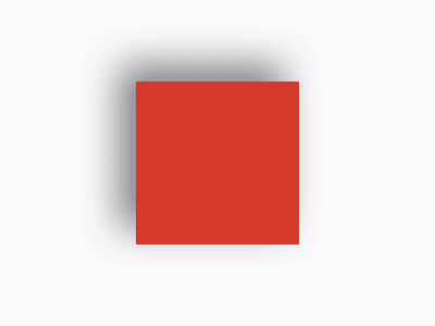
A rectangle with a shadow (Large preview)
This is how our square could look like, once exported to HTML/CSS:
<style>
  .square {
    width: 100px;
    height: 100px;
    background: red;
    box-shadow: 10px 10px 24px 0 rgba(0,0,0,0.5);
  }
</style>

<div class="square"></div>
A similar square exported from Sketch to SVG gives us a significantly more complex piece of code:
<defs>
  <rect id="square" x="14" y="14" width="100" height="100"></rect>
  <filter x="-31.0%" y="-31.0%" width="182.0%" height="182.0%" filterUnits="objectBoundingBox" id="filter-2">
      <feOffset dx="10" dy="10" in="SourceAlpha" result="shadowOffsetOuter1"></feOffset>
      <feGaussianBlur stdDeviation="12" in="shadowOffsetOuter1" result="shadowBlurOuter1"></feGaussianBlur>
      <feColorMatrix values="0 0 0 0 0   0 0 0 0 0   0 0 0 0 0  0 0 0 0.5 0" type="matrix" in="shadowBlurOuter1"></feColorMatrix>
  </filter>
</defs>

<g id="Rectangle">
    <use fill="black" filter="url(#filter-2)" xlink:href="#square"></use>
    <use fill="#FF0000" fill-rule="evenodd" xlink:href="#square"></use>
</g>
What happens here is that Sketch duplicates the square, so we have two identical squares, one above another, and turns the duplicate into a shadow.
To accomplish this, it applies a filter to a duplicated square that consists of three different filter primitives:
- one to offset the square;
- one to set its color to semi-transparent black;
- one to blur it.
In other design tools, we would encounter a similar situation.
It doesn’t mean that we should never, by all means, use shadows in SVG. It’s handy to keep in mind though that as long as SVG gives you a very powerful toolkit to modify your graphics, some seemingly simple effects are not that simple to achieve at all.
Blend Modes
Blend modes (such as Darken, Multiply or Overlay) allow blending two or more elements by combining their values in different ways. Well known to graphic designers (and applications such as Adobe Photoshop), blend modes work in Sketch, Figma and Illustrator as well.
In SVG, blend modes exist as one of the filters. They have their own filter primitive. However, as ‘s syntax is fairly complicated, Sketch, Figma and Illustrator use CSS instead:
.rectangle {
    mix-blend-mode: overlay;
}
With mix-blend-mode browser support being fairly good nowadays, it shouldn’t be a big issue. However, if it’s important for you to ensure bulletproof browser support that includes Microsoft Edge and IE, you will have to replace the CSS blend modes with SVG filters manually.
Same as with multiple fills and strokes, SVG does not support blend modes applied directly on fill and stroke attributes (rather than on whole layers). If you try to export fill and strokes with their own blend modes from a design tool to SVG, the layer will get multiplied and the blend modes applied to respective copies of the layer.
Symbols And Components
In some of the code examples above, you may have noticed an element we haven’t discussed yet: a … element. lets us define and reuse elements in SVG, a bit similar to Symbols in Illustrator and Sketch or Components in Figma. Remember defining patterns, gradients and filters within the … tags so they can be used in some other part of your SVG code? In fact, any SVG element can be defined and reused this way. Once you defined a shape or a group, you can refer to it in the rest of the document as many times as you like, e.g.:
    <defs>
<circle cx="100" cy="100" r="20" id="circle"/>
</defs>

<use fill="red" xlink:href="#circle"> </use>
<use fill="green" xlink:href="#circle"> </use>
<use fill="blue" xlink:href="#circle"> </use>
…
You can also reuse much more complex structures using a … tag. Symbol acts as a separate body within our SVG and can have its own viewBox attribute (see Width, height and viewBox for reference).
Does it mean our design tools’ symbols and components will be exported to SVG symbols? In Illustrator — yes, it does. In Sketch and Figma — no, it doesn’t. Why? Primarily, because Illustrator symbols are fairly simple and can be easily translated to SVG while Sketch’s symbols and Figma’s components are not that simple at all and exporting some of its features (such as nested overrides) would be very tricky or even impossible.
Text
It wouldn’t be a comprehensive guide if we don’t mention typography. All the design tools offer a wide variety of tools related to text. SVG, even though usually used for graphics, supports text elements too.
Illustrator, Sketch and Figma all support exporting text to SVG and computes text layers into … elements in SVG. SVG text elements are rendered like any other graphic elements, shapes etc. with the only difference is that they’re text.
Same as in CSS, we can control all the basic text’s parameters, such as weight, line height or alignment. In fact, if you know how to style text in CSS, you already know how to do it in SVG. However, it may feel a bit old-school. Firstly, all the parameters must be set in inline attributes, similarly to the golden standards of HTML 3.2. Secondly, there are no shorthands. For example, you won’t find anything resembling a font CSS property. That’s because SVG text attributes are actually based on CSS 2 spec which takes us back to the 90ties and are way older than CSS we know today.
Nonetheless, all of those attributes are being exported from the design tools perfectly well every time we want some text layer to become SVG code.
Custom Fonts
Unfortunately, things get a bit tricky when it comes to custom fonts. Back in the days, when SVG 1 standard was being created, custom typefaces weren’t a common thing to the web. Everybody used standard fonts, such as Tahoma, Verdana or Courier. Going fancy and using fonts people didn’t have on their machines by default, usually meant rasterizing them ruthlessly and using them as images. However, SVG implemented its own fonts format, named SVG fonts. Today, 18 years after the SVG 1.0 was published, SVG fonts are no longer supported in most of the major browsers.
Luckily for us, SVG plays very nicely with CSS, which means we can use web fonts instead of SVG fonts, e.g.:
<style>
    @import url("https://fonts.googleapis.com/css?family=Roboto");
</style>

<text x="20" y="50" font-family="Roboto">Text</text>
Let me not get into detail of implementing web fonts here apart from one crucial note: don’t forget about it. In other words, if you use custom fonts in your SVG, you need to remember about providing these fonts to the client, the same as in HTML/CSS.
Outlining Fonts
One may argue that much easier than warring about fonts and all, would be to outline all the text layers and don’t worry about them ever after. Nonetheless, there are at least a few good reasons not to change your text to shapes:
Working with outlined text, you need to remember about keeping an editable copy in your Illustrator, Sketch or Figma file at all times. Otherwise, you won’t be able to edit your text layers, once they are outlined. This adds unnecessary complexity to the process. Not to mention editing the outlined text after the SVG was exported. Text in SVG can be updated at any time. Outlined text requires opening the source file every time you want to make the tiniest copy change.
Text in SVG, same as other text elements on the web, can be read by screen readers and other accessible technologies. By outlining text layers, you prevent people from using such technologies from accessing your content.
Most people using the web know absolutely nothing about SVG, HTML or design tools. If they see text, they expect it to be just that. They may want to select it, copy it or put in a search engine. All of this is possible with text in SVG — unless you outline it.
Text in SVG is also accessible and used by search engines. By outlining text, you make your content less searchable and potentially less visible to the public.
Summary
Thank you a lot for going with me on a journey through the ins and outs of working with SVG and design tools. This article definitely does not cover the full spectrum of the topic, although it should be enough to deal with the most common use cases. If you have any questions or queries regarding the things that have not been mentioned here, don’t hesitate to post them in the comments!
(dm, yk, il)
From our sponsors: A Practical Guide To SVG And Design Tools


