A Brief Guide About Competitive Analysis

A Brief Guide About Competitive Analysis
A Brief Guide About Competitive Analysis
Mayur Kshirsagar
2018-08-30T14:00:57+02:00
2018-08-30T12:00:56+00:00
In this article, I will introduce the subject of competitive analysis, which is basically a method to determine how well your competitors are performing. My aim is to introduce the subject to those of you who are new to the concept. It should be useful if you are new to product design, UX, interaction or digital design, or if you have experience in these fields but have not performed a competitive analysis before.
No prior knowledge of the topic is needed because I’ll be explaining what the term means and how to perform a competitive analysis as we go. I am assuming some basic knowledge of the design process and UX research, but I’ll provide plenty of practical examples and reference links to help with any terms and concepts you might be unfamiliar with.
Note: If you are a beginner in UX and interaction design, it would be good to know the basics of the design process and to know what is UX research (and the methods used for UX research) before diving into the article’s main topic. Please read the next section carefully because I’ve added reference links to help you get started.
Recommended reading: Standing Out From The Crowd: Improving Your Mobile App With Competitive Analysis
Competitive Analysis, Service Design Cycle, Five-Stages Design Process
If you are a UX designer, then you might be aware of the service design cycle. This cycle contains four stages: discover, explore, test and listen. Each one of these stages has multiple research methods, and competitive analysis is part of the exploration. Susan Farrell has very helpfully distinguished different UX research methods and activities that can be performed for your project. (You can check this detailed segregation in her “UX Research Cheat Sheet”.)
The image below shows the four steps and the most commonly used methods in these steps.

(Large preview)
If you are new to this concept, you might first ask, “What is service design?” Shahrzad Samadzadeh explains it very well in her article, “So, Like, What Is Service Design?.”
Note: You can also learn more about service design in Sarah Gibbons’s article, “Service Design 101.”
Getting workflow just right ain’t an easy task. So are proper estimates. Or alignment among different departments. That’s why we’ve set up “this-is-how-I-work”-sessions — with smart cookies sharing what works well for them. A part of the Smashing Membership, of course.
Explore features →
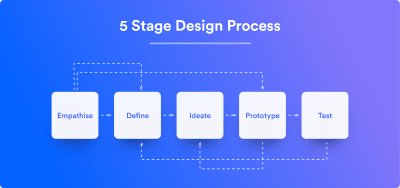
Often, UX designers follow the five-stages design process in their projects:

The five-stages design process. (Large preview)
Please don’t confuse the five-stages design process with the service design cycle. Basically, they serve the same purpose in the design thinking process, but are explained in different styles. Here is a brief explanation of what these five stages contain:
- Empathize
This stage involves gaining a clear understanding of the problem you are trying to solve from the user’s point of view. - Define
This stage involves defining the correct statement for the problem you are trying to solve, using the knowledge you gained in the first stage. - Ideate
In this stage, you can generate different solution ideas for the problem. - Prototype
Basically, a prototype is an attempt to give your solution some form so that it can be explained to others. For digital products, a prototype could be a wireframe set created using pen and paper or using a tool such as Balsamiq or Sketch, or it could be a visual design prototype created using a tool such as Sketch, Figma, Adobe XD or InVision. - Test
Testing involves validating and evaluating all of your solutions with the users.
You can perform UX research at any stage. Many articles and books are available for you to learn more about this design process. “Five Stages in the Design Thinking Process” by Rikke Dam and Teo Siang is one of my favorite articles on the topic.

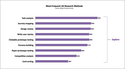
The most frequent methods used by UX professionals during the exploration stage of the design life cycle. (Nielsen Norman Group, “User Experience Careers” survey report) (Large preview)
According to Nielsen Norman Group’s “User Experience Careers” survey report, 61% of UX professionals prefer to do the competitive analysis for their projects. But what exactly is competitive analysis? In simple language, competitive analysis is nothing but a method to determine how your competitors are performing, what they are offering and how well they are doing it.
Sometimes, competitive analysis is referred as competitive usability evaluation.
Why Should You Do A Competitive Analysis?
There are many reasons to do a competitive analysis, but I think the most important reason is that it helps us to understand the rights and wrongs of our own product or service.
Using competitive analysis, you can make decisions based on knowledge of what is currently working well for your users, rather than based on guesses or intuition. In doing competitive analysis, you can also identify risks in your product or service and use those insights to add value to it.
Recently, I was working on a project in which I did a competitive analysis of a feature (collaborative meeting note-taking) that a client wanted to introduce in their web app. Note-taking is not exactly a new or highly innovative thing, so the biggest challenge I was facing was to make this functionality simpler and easier to handle, because the product I was working on was in the very early stages of development. The feature, in a nutshell, was to create a simple text document where some interactive action items could be added.
Because a ton of apps are out there that allow you to create simple text documents, I decided to do a competitive analysis for this functionality. (I’ll explain this process in more detail later in the section “Five Easy Steps to Do a Competitive Analysis”.)
How To Find The Right Competitors?
Basically, there are two types of competitors: direct and indirect. As a UX designer, your role is to study the designs of these competitors.
Jaime Levy gives very good definitions of direct and indirect competitors in her book UX Strategy. You can learn more about competitive analysis (and types of competitors) in chapter 4 of the book, “Conducting Competitive Research”.

Types of competitors. (Large preview)
Direct competitors are the ones who offer the same, or a very similar, set of features to your current or future customers, which means they are solving a similar problem to the one you are trying to solve, for a customer base that you are targeting as well.
Indirect competitors are the ones who offers a similar set of features but to a different customer segment; or, they target your exact customer base without offering the exact same set of features, which means indirect competitors are solving the same problem but for a different customer base, or are solving the same problem but offer a different solution.
You can search for these types of competitors online (by doing a simple web search), or you can directly ask your current and potential customers what they are using already. You can also look for your direct and indirect competitors on websites such as Crunchbase and Product Hunt, and you can search for them in the Google Play and the iOS App Store.
Five Easy Steps To Do A Competitive Analysis
You can perform a competitive analysis for your existing or new product using the following five-step process.

5 steps to do a competitive analysis. (Large preview)
1. Define And Understand The Goals
Defining and understanding the goal is an integral part of any UX research process. You must define an accurate goal (or set of goals) for your research; otherwise, there is a chance you’ll get the wrong outcome.
Draft all of your goals right before starting your process. When defining your goals, consider the following questions: Why are you doing this competitive analysis? What kind of outcome do you expect? Will this analysis affect UX decisions?
Remember: When setting up goals for any kind of UX research, be as specific as possible.
I mentioned earlier that I recently performed a competitive analysis for a collaborative meeting note-taking feature, to be introduced in the app that I was developing for a client. The goals for my research were very general because innumerable apps all provide this type of functionality, and the product I was working on was in the very early stages of development.
Even though your research goals might be simple, make them as specific as possible, and write them all down. Writing down your goals will help you stay on the right track.
The goals for my analysis were more like questions for which I was trying to find the answers. Here is the list of goals I set for this research:
- Which apps do users prefer for note-taking? And why do they prefer them?
Goal: To find out the user’s behavior with these apps, their preferences and their comfort zone. - What is the working mechanism of these apps?
Goal: To find how out competitors’ apps work, so that we can identify their pros and cons. - What are the “star” features of these apps?
Goal: To identify functionalities that we were trying to introduce as well, to see whether they already exist and, if they exist, how exactly they were implemented. - How comfortable does a user feel when using these apps?
Goal: To identify user loyalty and engagement in the apps of our competitors. - How does collaborative editing work in these competitive apps?
Goal: To identify how collaborative-editing functionality works and to study its technical aspects. - What is the visual structure and user interface of these apps?
Goal: To check the visual look and feel of the apps (user interface and interaction).
2. Find The Right Competitors
After setting the goals, go on a search and make a list of both direct and indirect competitors. It’s not necessary to analyze all of the competitors you find. The number is completely up to you. Some people suggest analyzing at least two to four competitors, while others suggest five to ten or more.
Finding the right competitors for my research wasn’t a hard task because I already knew many apps that provided similar features, but I still did a quick search on Google, and the results were a bit surprising — surprising because most of the apps I knew turned out to be more like indirect competitors to the app I was working on; and later, after a bit more searching, I also found the apps that were our direct competitors.
Putting each competitor in the right list is a very important part of competitive analysis because the features and functionality in your competitors’ apps are based on exactly what users of those apps want. Let’s assume you put one indirect competitor, XYZ, under the “direct competitors” list and start doing your analysis. While doing the research, you might find some impressive feature in XYZ’s app and decide to add a similar feature in your own app; then, later it turns out that the feature you added is not useful for the users you are targeting. You might end up wasting a lot of energy, time and money building something that is not at all useful. So, be careful when sorting your competitors.
For my research, the competitors were as follows:
- Direct competitors br>Quip, Cisco Spark Meeting Notes, Workboard, Lucid Meeting, Less Meeting, MeetingSense, Minute-it, etc.
- All of the apps above provide the same type of functionality, which we were trying to introduce for almost the same type of user base.
- Indirect competitors br>Evernote, Google Keep, Google Docs, Microsoft Word, Microsoft OneNote and other traditional note-taking apps and pen-paper note-taking methods.
- The user base for all of the above is not exactly different from the user base we were targeting, but most of the users we were targeting were using these apps because they were unaware of the more convenient ways to take meeting notes.
3. Make A Competitive Analysis Matrix
A competitive analysis matrix is not complex, just a simple spreadsheet. You can use Microsoft Excel, Google Sheets, Apple Numbers or any other tool you are comfortable with.
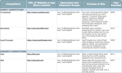
First, divide all competitors you’ve found into two groups (direct and indirect) and put them in a spreadsheet. Jamie Levy suggests making the following columns:

Example of competitive analysis matrix spreadsheet from UX Strategy, Jaime Levy’s book. (Large preview)
I would recommend digging a bit deeper and adding a few more columns, such as for “unique features”, “pros and cons”, etc. It would help to summarize your analysis. It’s not necessary to set your columns exactly as mentioned above. You can modify the columns to your own research goals and needs.
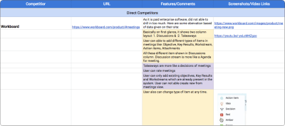
For my analysis, I created only four columns. My competitive analysis matrix looked as follows:
- Competitor name br>In this column, I put the names of all of the competitors.
- URL br>These are website links or app download links for these competitors.
- Features/comments br>In this column, I put all of my comments, some ”star” features I needed to focus on, and the pros and cons of the competitor. I color-coded the cells so that later I (or anyone viewing the matrix) could easily identify the difference between them. For example, I used light yellow for features, light purple for comments, green for pros and red for cons.
- Screenshots/video links br>In this column, I put all of the screenshots and videos related to the features and comments mentioned in the third column. This way, it became very easy and quick to understand what a particular comment or feature was all about.

(Large preview)
4. Write A Summary And An Analysis
Once you are done with the analysis matrix spreadsheet, move on and create a summary of your findings. Be as specific as possible, and try to answer all of your questions while setting up a goal or during the overall process.
This will help you and your team members and stakeholders make the right design and UX decisions. This summary will also help you find new design and UX opportunities in the product you’re building.
In writing the summary and the presentation for the competitive analysis that I did for this collaborative note-taking app, the competitive analysis matrix helped me a lot. I drafted a document with all of the high-level takeaways from this analysis and answered all of the questions that were set as goals. For the presentation, I shared the document with the client, which helped both the client and me to finalize the features, the flows and the end requirements for the product.
5. Presentation
The last step of your competitive analysis is the presentation. It’s not a typical slideshow presentation — rather, just share all of the data and information you collected throughout the process with your teammates, stakeholders and/or clients.
Getting feedback from everywhere you can and being open to this feedback is a very important part of the designer’s workflow. So, share all of your finding with your teammates, stakeholders and clients, and ask for their opinion. You might find some missing points in your analysis or discover something new and exciting from someone’s feedback.
Conclusion
We live in a data-driven world, and we should build products, services and apps based on data, rather than our intuition (or guesswork).
As UX designers, we should go out there and collect as much data as possible before building a real product. This data will help us to create a solid product that users will want to use, rather than a product we want or imagine. These kinds of products are more likely to succeed in the market. Competitive analysis is one of the ways to get this data and to create a user-friendly product.
Finally, no matter what kind of product you are building or research you are conducting, always try to put yourself in the users’ shoes every now and then. This way, you will be able to identify the users’ struggles and ultimately deliver a better solution.
I hope this article has helped you plan and make your first competitive analysis for your next project!
Further Reading
If you want to become a better UX, interaction, visual (UI) or product designer, there are a lot of sources from which you can learn — articles, books, online courses. I often check the following few: Smashing Magazine, InVision blog, Interaction Design Foundation, NN Group and UX Mastery. These websites have a very good collection of articles on the topics of UI and UX design and UX research.
Here are some additional resources:
- “Chapter 4: Conducting Competitive Research”, UX Strategy, Jaime Levy
- “User Research Cheat Sheet”, Susan Farrell, Nielsen Norman Group
- “Competitive Usability Evaluations: Learning from Your Competition”, Amy Schade, Nielsen Norman Group
- “How to Do a UX Competitor Analysis: A Step by Step Guide”, Steven Douglas, Usability Geek
- “How to Check Out the Competition”, Sarah Khan, UX Booth
- “A Designer’s Guide to Competitor Research”, Dan Lachapelle, Wayfair
- “A Product Designer’s Guide to Competitive Analysis”, Chandan Mishra, Toptal

(mb, ra, al, yk, il)
From our sponsors: A Brief Guide About Competitive Analysis


