How Web Designers Can Help Restaurants Move Into Digital Experiences
How Web Designers Can Help Restaurants Move Into Digital Experiences
Suzanne Scacca 2020-06-23T12:00:00+00:00
2020-06-23T12:41:09+00:00
As much as I’ve always loved the experience of going out to eat and ordering in takeout, it’s very rare that I enjoy visiting a restaurant’s website. But I get it. The restaurant industry tends to run on very slim profit margins, so it’s hard to justify spending money on a professionally designed website when all they want it to do is list their hours of operation and menu.
However, I envision all that changing in 2020 (and beyond) as restaurants are forced to expand into digital in order to survive. Unlike a website that a novice might hack together with a cheap site builder, establishing a competitive digital presence isn’t something they’re going to be able to do on their own.
That’s why web designers should seriously start thinking about expanding into this niche.
How Web Designers Can Help Restaurants Move into Digital
Usually, when something serious shakes up the restaurant industry, those that want to survive will adopt newer and better technologies to adapt. So, it’s not like restaurants are strangers to digital transformation. Until now, though, the focus has mainly been on investing in technology that improves how they work in-house.
With everything that’s happened in 2020, though, restaurants are going to need web designers’ help in doing three things that ensure their survival in an increasingly digital world:
1. Modernize The Restaurant Website
Whenever I write one of these posts, I spend time reviewing a few dozen websites to find the best examples to make my point. I’m not going to lie, this one was tough. While I knew I could turn to national chain restaurants to find modern-looking websites, I had a really hard time with others.
While it’s not impossible to find an independent restaurant operator or local chain that has a great-looking website in 2020, I’d say that at least half of them are way behind the times, if they even have a website at all.
Remember when websites were designed like this?

I’ve blurred out the restaurant’s name and details to protect its identity, but you can still get a sense of how bad this design is for 2020.
Restaurant websites can’t afford to be crappy, non-responsive placeholders anymore. They need to become impressive digital presences that set the stage for what customers will experience when interacting with restaurants as diners.
Let’s take a look at how In-N-Out Burger has nailed modern web design. The first thing you’ll notice is it’s a responsive design. On desktop, the website fits the full width of the screen, so there’s no wasted space around the border. It looks good on a mobile device, too:
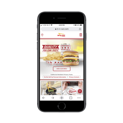
Also, take notice of the images. This is a burger joint, so you should expect the website to be full of burger photos, which it is. However, there’s something interesting to note about the burgers you find on the site.
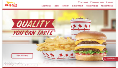
When someone enters a page where there’s a burger photo, the food slides into the frame as if someone were sliding it over to a customer in the restaurant. It’s a neat little transition and many visitors to the site might not even realize what’s happening, but it makes the experience feel more lifelike and interactive.
Transitions aren’t the only things you can do to create this sort of experience. Background videos taken within the establishment work just as well as it gives customers the opportunity to walk through the establishment instead of relying on static images that only paint part of the picture.
Another thing restaurant websites need to improve is how they’re organized.
When people are ready to go out to eat or to dine in, don’t waste their time trying to force the restaurant’s history down their throats (which many of these sites surprisingly do). The navigation as well as the order in which CTAs appear on the home page should reflect the actions customers want to take.
The thought process most likely goes like this:
- “I’m not sure what to order. Where’s the menu?” (Menu)
- “Do I need to make a reservation or can we just go whenever?” (Reservations)
- “Where is this place again?” (Locations or Contact)
Or, these days, #2 looks more like this:
- “Do they do takeout? I wonder if they’ll deliver it.” (Order Online)
There are other things customers might want to do on the website. Like buy gift cards or merchandise, sign up for rewards or apply for a job.
So, while the above tasks should be a priority in terms of what visitors see first, make sure to look at the site’s data to see what else they’re interested in doing. Then, make sure those popular actions take center stage in the navigation and site design.
2. Empower Them to Diversify Their Income
Under normal circumstances, profitability is a problem for many restaurants. Add a crisis to the mix and it’s going to become downright impossible to generate any profit — that is if they rely solely on dine-in business.
Long before COVID-19, consumers were already showing a growing preference for digital dining solutions.
According to Peapod, 77% of U.S. consumers said they preferred eating at home than going out. But that doesn’t necessarily translate to ordering in from a restaurant.
- 27% preferred to order groceries online and pick them up from the store.
- 26% planned to use grocery delivery.
- 20% were interested in meal kits.
Then, you have information from Technomic and the National Restaurant Association that found that about 60% of all restaurant sales in the U.S. come from off-premise dining.
For restaurants that haven’t yet made the leap to digital dining options, they’re going to have to ASAP. This isn’t just a temporary thing either.
Restaurants that fail to digitize going forward won’t survive.
“
So, web designers are going to be needed to help them build out the following:
- An online ordering system for their website or a link to an external service,
- A reservation system (for when in-house dining is available).
That’s just the bare minimum though. For instance, this is what Snooze Eatery has done:
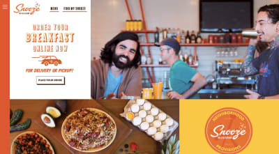
The first thing visitors see on the website is the online ordering option. When they click “Place Your Order”, they’re taken to the restaurant’s proprietary ordering portal:

This in and of itself is a great solution for restaurants to have available through their websites as it allows them to control the ordering process and capture more of the profits (but that’s up to your clients to decide, of course). That said, many restaurants are getting creative and going beyond traditional online ordering options.
Below the fold on the Snooze Eatery site, visitors will find this banner:

As I mentioned earlier, there’s a good number of people who want to be able to order food online but then prepare it for themselves at home. While that would previously have left restaurants high and dry, that’s not the case anymore as many restaurants are expanding their offering to include family-style meal kits and groceries like Snooze.
This alone means that web designers are going to become increasingly more important for restaurants. And don’t expect the work to end there. Restaurants will also need your help building other monetized offerings into their websites. For instance:
- Gift cards;
- Merchandise;
- Subscription services for meal kits, alcohol deliveries and more;
- Online memberships for cooking classes, premium recipes, etc.
If they don’t have one yet, they’ll also probably need help creating a rewards and account management system as well.
3. Fix Their Brand Images on Third-party Sites
Although the website should be the engine that powers everything for the business online, restaurants need other sites to help with visibility, too. For example:
- Facebook to share photos, advertise location information and collect customer reviews;
- Instagram to share photos, restaurant updates and customer-generated content;
- Yelp and TripAdvisor to collect customer reviews and feedback;
- Google My Business to create a local presence in Google search and Maps as well as to collect reviews;
- Delivery services like DoorDash to outsource delivery to;
- Reservation sites like OpenTable to outsource reservation bookings to.
If customers are looking for restaurants online, they need to be willing and able to meet them where they are… before eventually bringing them to the website.
Although it’s ultimately the restaurant’s responsibility to create these pages, you should provide assistance when it comes to the visual branding piece. For one, it ensures that there’s some consistency between all their platforms. Also, it enables you to fill in missing pieces that restaurateurs might not think about.
Let’s take a look at Rhode Island staple, IGGY’S:
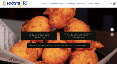
The waterfront eatery immediately gets down to business and provides visitors with 3 options for ordering online (based on which location they want to go to).
Here’s what the online ordering portal looks like:
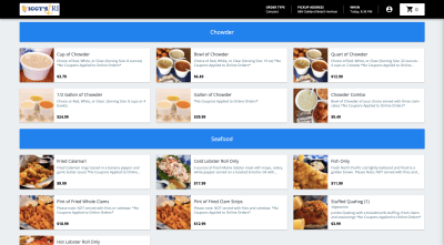
Notice how good this looks. It takes what would otherwise be a text-only menu and turns it into something much more attractive and, arguably, more effective in driving up sales.
Now, contrast that with IGGY’S online ordering through DoorDash:
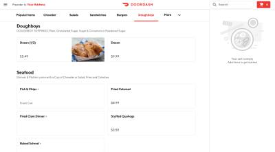
The items on this page rarely come with descriptions or images.
Now, IGGY’S is a well-known restaurant around Rhode Island, so this might not be a dealbreaker for online customers. However, new customers might approach the menu with more trepidation than the one available through the IGGY’S website since it’s devoid of details.
This is where your visual-centric approach comes in handy. By making sure each item comes with a high-resolution and mouth-watering photo (the same as the one used on the site), you can optimize this sales opportunity for them.
It’s also important to ensure the brand elements are consistently presented. That way, if an existing customer runs across their favorite restaurant on DoorDash, they won’t hesitate to order because they’ll instantly know it’s their favorite restaurant.
For example, the logo on DoorDash is nothing like the one on the website in terms of quality or looks:

Be it the logo or another branded element, you want to make sure that 1) it matches the website and 2) looks good. This goes for online ordering sites like DoorDash as well as all the other ones I mentioned earlier.
Wrapping Up
We’re at a point now where restaurants can no longer be reluctant or stingy about improving their digital presence. And, as a web designer, this should get you excited.
There’s a lot you can do to help businesses in this space beyond designing basic websites. Because so much of their digital transformation involves making sales online, you’ll get to design experiences that are intuitive, modern, and mouth-watering while also creating new monetized pathways for them.
(ra, yk, il)
From our sponsors: How Web Designers Can Help Restaurants Move Into Digital Experiences


