Designing For The Future With Voice Prototypes
Designing For The Future With Voice Prototypes
Designing For The Future With Voice Prototypes
Nick Babich
2019-05-02T12:30:16+02:00
2019-05-02T12:34:57+00:00
(This article is kindly sponsored by Adobe.) Voice-enabled interfaces are challenging the long dominance of graphical user interfaces and are quickly becoming a common part of our daily lives. According to a survey run by Adobe, 76 percent of smart speaker owners increased their usage of voice assistants over the last year.
In this article, I’ll share a flow that you can use to create voice-based experiences. But before we dive into the specific recommendations on how to design for voice, it’s important to understand the user expectations about it.
Why Do People Expect More From Voice?
Voice User Interfaces (VUIs) not only introduce a change in a way people interact with machines, but they also raise the bar for the quality of interaction. When people interact with GUI’s and have troubles with them, they often blame themselves, but when people interact with VUIs and are unable to complete a task, they blame the system.
Why is that? Well, talking is the most naturally convenient medium for communication between people, and people are confident in their talking skills. This can have a direct influence on the retention rate: A 2017 report by Voicelabs states there’s only a 6 percent chance a user will be active in the second week after downloading a voice application.
Design Process
Many designers think that designing voice-based experiences is completely different from graphical user interfaces. That’s not true.
Designing voice-based experiences is not a new direction in UX design; it’s a next natural step. It’s possible to adapt the design process that we use for visual interfaces for voice-based products.
There are five steps should take place before starting development a voice product:
The great thing about this process is that it can be applied to all types of voice interfaces, whether it is a voice-enabled, voice-only or voice-first.
1. Research
Similar to any other digital product we design, we need to apply user-first design in the context of voice user interfaces. The goal of user research is to understand the needs and behaviors of the target user. The information you gather during this step will be a foundation for product requirements.
Identify The Target Audience
Defining and researching the target audience of a product should be one of the first steps in the design process.
Here’s what to focus on during this step:
- Look at the current experience and how the users are solving their problem now. By identifying pain points, you’ll find the cases where voice can benefit your users.
- User language. The exact phrases that a target user uses when they speak with other people. This information will help us to design a system for different utterances.
2. Define
During this step, we need to shape our future product and define its capabilities.
Define Key Scenarios Of Interaction
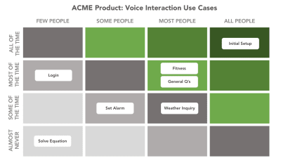
Scenarios come before specific ideas for app — they’re a way to think about the reasons someone might have to use a VUI. You need design scenarios that have high value for your target users. If you have many scenarios and do not know which ones are important and which are not, create use case matrix to evaluate each individual scenario. The matrix will tell you what scenarios are primary, what are secondary what are nice-to-haves.

Applying use case matrix to voice interactions. Image: Justin Baker. (Large preview)
Make Sure Key Scenarios Work With Voice
There should be a compelling reason to use voice. Users should be able to solve the problem faster or more efficiently using voice than any of the alternative experiences.
A few common cases when voice interaction might be preferable for users:
- When user’s hands are busy (while driving or cooking);
- When using voice is an easier and more natural way to interact (for example, it’s much easier to tell your smart speaker to “Play Jazz” rather than jump to a media center and select the right option using a GUI).
Your goal for this step is to identify both common and specific cases that your users will benefit from. It’s also important to consider the limitations of voice interactions. For example, selecting from a long list of menu items is problematic with voice interactions. A good rule of thumb is to keep choices short and to the point — 3 selections maximum. If you find you have more than 3, it’s best to reframe the scenario.
3. Create
With voice prototypes, it’s important to start at the drawing board. The first step is to tackle the voice user flows of your experience, which is the basis from which all user interaction will map back to.
Use Storyboards
Storyboards visualize interactions and flows in context and make them feel more realistic.
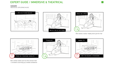
A storyboard that illustrate the flow. Image: BBC. (Large preview)
Write Dialogues
Dialogues are the building blocks of voice user flows. For each key scenario that the voice app will support, start creating conversational dialogues between the user and the app.
Strive to make interacting with the app as familiar as having a regular conversation with a real person. Human conversation is complex; it often has many twists and turns. It will be important to take this into account when working through your scenarios and writing dialogues.
A few general recommendations for creating great dialogues:
- Reduce the number of steps it takes to complete a task.
Try to eliminate unnecessary information and questions wherever possible. Design should solve the user’s problem with the minimum number of steps. Remember that the longer it takes to complete the task, the less enjoyable the experience becomes. No one likes products that drain on their valuable time, and this is especially true for repetitive tasks. Your app should provide a delightful user experience whether it’s the first time a user completes the task, or it’s the 100th time this month. - Don’t teach “commands”.
Given how hard discovery can be in voice, some designers try to teach users commands so they know what to say. Don’t do that. Phrasing should be natural and intuitive, so users will know what to say in particular situations. - Be brief with your questions and responses.
It’s relatively easy to overload users with too much information when you use long sentences. Try to simplify messages to their essence wherever possible. Users enjoy concise and well-defined information from VUI.
Think about what information is primary, and what information is secondary. Follow the principle of Maximum of Quantity which says that a speaker provides the listener as much information as is necessary to advance the perceived purpose of the interaction but not too much.
Here is a dialogue that doesn’t follow the principle of Maximum of Quantity:
User: “Where’s a good place to go for pizza?”
System: “I have five places for you. The first one is “Pizza & Pasta” is located on 1300-1398 Diamond St San Francisco, 15 minutes away from you, open from 8:00 AM till 8:00 PM, the second is “Italy” which is located on 4100-4148 20th St San Francisco, 1 hour away from you, open from 9:00 AM till 6:00 PM,…”
The dialogue tries to present all options in a single turn. It’s better to try to narrow down the list by asking a clarifying question:
User: “Where’s a good place to go for pizza?”
System: “There are several pizza restaurants in the area — would you like to walk, or drive?”
Handle Errors
No matter how good your VUI will be, one thing is for sure: things will go wrong. And you need to design for those situations. Graceful handling of errors is one of the biggest challenges you’ll face when designing for voice and it’s vital to start thinking about it right at the time when you write your dialogues.
Here are a few common cases that can cause error states:
- Misspellings
Some users can mispronounce words and the natural language processing system won’t understand the request. - Ambiguity
Even between humans, speech is sometimes ambiguous. For example, someone might say “Good” and that could be defined as ‘Yes, I agree’ or just be an indication that they’re listening. - Cases when the system is unable to provide valuable information for users. For example, the user wants to book a flight, but the system doesn’t have relevant options.
In all cases, the dialogue shouldn’t end up in a dead end; the system should provide valuable options. Always try to get the dialog back on track.
Let’s check out the first example:
User: “Book me a flight from San Diego to Dallas on Monday.”
System: “I couldn’t find any flights from San Diego to Dallas on Monday.”
It’s evident that users face a dead end. However, it’s relatively easy to modify the dialog to provide some options for users:
User: “Book me a flight from San Diego to Dallas on Monday.”
System: “I couldn’t find any flights from San Diego to Dallas on Monday. Would you like to search for another date?”
Another example for food ordering app:
User: “What’s the ZIP code for delivery?”
System: “Hmm, 811415”
User: “This ZIP is invalid. Try again.”
Not only the word “Invalid” is too technical, but it also doesn’t help get the user back on track. It’s better to offer a user a hint so they can understand what they should do next:
System: “What’s the ZIP code for delivery?”
User: “Hmm, 811415”
System: “This ZIP is longer than expected. It should be five digits, not six.“
User: “81415”
Reflect Your Unique Identity
All voices project a persona whether you plan for one or not. Don’t leave your VUI persona to chance, reflect your unique brand and identity in dialogues you write. Imagine how your ideal employee should interact with customers and try to reflect it in the wording of your dialogues.
Tone of voice has measurable impacts on users’ perceptions of a product. That’s why it’s important to consider the emotional needs of your users when choosing a tone.
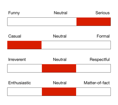
A product’s tone of voice can be expressed as a function of the 4 tone dimensions. Image: NNGroup. (Large preview)
Bake Empathy In Interactions
Voice interfaces should take user emotions into account. People like not only friendly people but also friendly computers. For example, when someone wants to book a ticket for a flight and provides information about a trip, the system might respond ‘Sounds like a fun trip!’ The response should be slightly different each time to prevent a feeling of interaction with a machine.
Confirm When A Task Has Been Completed
It’s vital to think about where in the conversation flow the users need confirmations. Usually, people expect a final confirmation at the end of a dialogue. For example, when a user schedules an event, they might want to hear the “The event is on your calendar now.”
Another typical scenario is a checkout flow — let the user know that the transaction has been successfully recorded.
Use explicit confirmation for important actions and implicit for routine tasks. For example, if you ask your Alexa to send money to your friend, a user probably wants to hear “The [amount of money] was sent to [name of the person]” rather than just “OK.” At the same time, when you ask Alexa to turn off the lights in a garage, hearing “The lights in the garage are off” all the time might be too much, so be sure to test confirmations carefully to find out what confirmations your users feel is critical in order to feel successful with the VUI.
Leverage Context
A good conversational system keeps track of the dialog, memorizing all previous turns and of previous interactions. A solid system will use this information to create a better experience for users by offering a more personalized experience.
For example, when a user orders pizza, the system might remind them about their previous order:
User: “I want to order a pizza.”
System: “Last time you ordered Quattro Formaggio from Pizza & Pasta. Do you want to order it again?”
User: “Yay, I do!”
Cover Alternate Phrases
People can use different words to describe the same thing, and it’s vital to take this moment into account when designing your VUI. For each voice user flow that you designed in the previous step, think about the different ways users could phrase those requests. Consider word variations and synonyms that they might use.
Depending on the capabilities of your voice product, the number of utterances that users can vocalize when interacting with VUI can easily run into the hundreds, making the task of mapping them out really complex. Fortunately, there are special tools available to help you with that. For example, if you design apps for Alexa, you can use Amazon Echo Utterance Expander for that purpose.
Test Your Dialogues
Now when you have all your dialogues written, it’s time to start testing them. Why? Because the way we speak is far less formal than the way we write. To make sure you design dialogues that sound natural, it’s vital to test them before moving to prototyping.
Two simple techniques will help you do it:
- Record and play audio with your dialogs. You’ll hear nuances of words and sentences that just aren’t natural.
- Role play conversations to make sure they’re natural and intuitive. A technique called ‘Wizard of Oz’ will help you quickly identify the problems in your dialogues. If you’re Mac user, you can use a tool called Say Wizard to make things easier.
Prototype Your App
Now that we’ve written, mapped and tested our dialogues we can finally move on to designing and prototyping the experience. Adobe XD makes it easy for designers to create a working prototype for voice-enabled Amazon or Google apps and test it with real users. The tool allows you to prototype the actual voice inputs and outputs for the app.
A typical interaction consists of user input and system responses:
- To design user requests, we need to create voice triggers. To add a new voice trigger, drag a connector from an element in one artboard to another. When the attributes menu opens, select
Voicefrom Trigger menu and add your utterance in the Command field. Speech Playbackwill simulate the response of the voice app. To add Speech Playback, you need to select Time as theTriggerand set the action toSpeech Playback.
Prototyping with Voice in Adobe XD
Adobe XD allows you to prototype for voice-first products like the Amazon Echo Show, and voice-only products such as Google Home.
A few folx have asked about voice-only prototypes in #adobexd – below I made a quick prototype of a Google Home timer in XD using:
🔸Vector file from Illustrator to XD
🔸Auto Animate for the lights
🔸Voice Command as trigger
🔸Speech Response
…no screen, no problem 😉 pic.twitter.com/pz3pEvZVmZ— Susse Sønderby (@SusseSonderby) October 23, 2018
Last but not least, if you design Amazon Alexa Skill for Amazon Echo Show or Amazon Echo Spot, XD provides a VUI kit for those devices. You can download it here. This VUI kit provides all the building blocks you need to get started building an Alexa skill.
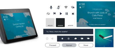
VUI kit for Amazon Echo Show and Spot. (Large preview)
4. Test
Testing is a mandatory part of the design process. Without testing, you can’t say whether your app will work for your users or not.
Test Your Prototypes With Target Users
Conduct usability testing sessions with representatives from your target audience, and observe how users interact with your app. Track the tasks completion rate and CSAT (Customer Satisfaction Score). If possible, try to record a video for each session.
Use Test Simulators
Both Amazon and Google provide testing tools that let you test your Skill or Action in simulation of the hardware devices and their settings. This testing will give you a good feel for the voice experience in the real world.
5. Refine
Refine the voice application after sending it to the market.
Collect Analytics
Once you’ve rolled out your app, you should track how the app is being used with analytics. Here are some of the key metrics to keep an eye out for are:
- Intents and utterances,
- User engagement metrics,
- Behavior flows.
Most of the metrics you need you will find within your Skill developer account without any additional coding.
Conclusion
Human-computer interaction has never been about graphical user interfaces. First and foremost, it has always been about communication. It’s evident that voice will be a natural way for the new generation of users to interact with technology, and as a designer, you should be ready for these new challenges and the opportunities they unlock for new ways of looking at interaction design.
This article is part of the UX design series sponsored by Adobe. Adobe XD tool is made for a fast and fluid UX design process, as it lets you go from idea to prototype faster. Design, prototype and share — all in one app. You can check out more inspiring projects created with Adobe XD on Behance, and also sign up for the Adobe experience design newsletter to stay updated and informed on the latest trends and insights for UX/UI design.
(yk, il)
From our sponsors: Designing For The Future With Voice Prototypes


