How to create product content to drive sales
Product content driving visual commerce
There are many different types of content. Product content is vital in online retail because it is the digital representation of the product being sold. In its simplest forms, product content is product images, video, copy and technical drawings.
Until recently, product images were just considered assets, and the quality and consistency of them could be very poor across a site.
However, product content is coming to the fore under a new label of ‘Visual Commerce,’ in recognition of its role in improving conversion in online retail.
Linking retail content with user-generated content
Visual commerce also includes customer generated images that link back to a product via Instagram or Pinterest for example, but retailers have the greatest control over the content they commission themselves, and making their own product content work harder will give them better returns from ever-growing content budgets.
So how can retailers make product content work harder, and what does this look like?
In online retail most product content follows a fairly standard formula, which is often a series of basic product images. There are many different approaches taken by retailers, some of which we look at below, but for some years now, there has been little innovation in the digital product experiences.
Case study: How to take visual commerce to the next level
Product content has to be tackled at product level, so for the purpose of this article, and to help us give some practical insights, we’re using the example of selling sofas online.
To get an understanding of current product content models, we take a look at some examples of how it is done by some well-known UK retailers.
In this case study we review the images that are being used on the product pages for three different retailers, then we show you a process that explains how to plan a more effective visual commerce solution.
DFS
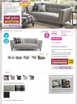
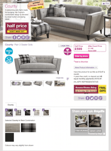
We start our retailer audit with this product page layout for DFS, a well-known furniture retailer here in the UK. When you look at this page, you can see there are there are 2 distinct categories of visual content in use; inspirational images and informative images.
The room-set images provide the inspiration, and as the primary image on the page in this page design, it brings an immediate wow factor, adds interest and engages the shopper, encouraging them to stay on the page.
The use and position of this image gives the page a strong design, and pulls the brand identity right through to the point where shoppers are making their purchasing decisions.
DFS have always valued the role of room-sets to sell their products because they work in a number of ways. They are good for cross-sell; they place products into real-life settings that help shoppers match products to their own room-style preferences, and they give a stronger brand identity to the visual content.
The second category of visual content is informative images. These are simple cut out images, often computer generated. Despite the fact there are 5 cut out images, the total experience offers the shopper very little additional detail about the sofa.
360 images are popular and count as informative images, and they at least offer the shopper the opportunity to look at a side and back view of the product, but quite often they show at a distance, which in this category, don’t add much information into the mix.
It’s interesting that so much space in the template is given over to product information, yet so much product detail is actually missing. This is something many retailers neglect, and they miss a valuable opportunity to really get the product detail and quality across in the images and video.
Debenhams
Another well-know UK retailer, with a markedly different visual product experience. Debenhams give the shopper a much more basic product experience – a single front view – despite the fact that the sofa is 30% more expensive than the previous example.
A big purchase decision demands product detail
Sofas are a major purchase, people only buy them every 5+ years and they are expensive, considered items. A shopper will have many criteria influencing their decision; the sofa has to fit into an existing room and colour scheme, and equally importantly, it has to fit into a lifestyle. All of these elements mean the shopper wants a lot of information and reassurance about a product before they will buy.
The online experience affects the likelihood to go in store
We’ve heard this countered by the fact that most people won’t buy a sofa without seeing it first in a store. Shoppers research sofas online to create a shortlist of stores to visit, but we’ve learned from qualitative research sessions that a sofa won’t make that shortlist if the online product experience isn’t good enough.
Made.com
For our final example, we look at Made.com. This retailer has been the only real innovator in content in the furniture sector in the UK.
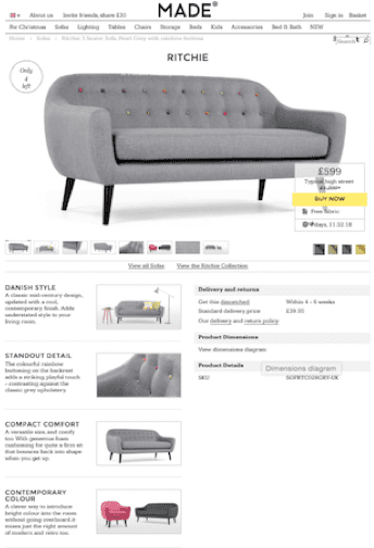
Image-centric product page design
As a pure play retailer they recognised the importance of product content right from the start, and their product page design makes an immediate hero of the product. They’re also unique in the number of additional product images they offer their customers, and the diversity of the information they provide across those images.
Their page design has been created to highlight the volume of those additional images so they are immediately apparent to the shopper. Many retailers show a small selection of images from a larger carousel. Made.com celebrate rather than hide their extensive product content.
Their image strategy was a game changer and influenced more established retailers, but very few have been able to match their product experience.
Taking the shopper closer to the product
You can see that they have mainly focused on using information images but have made them work harder. The art direction has made them more aspirational than the rest of the market. The use of a lower camera height, and careful angling gives the product more drama and a more contemporary edge. They championed the use of cameos to help the customer understand the detail more clearly and give them a more intimate experience.
Made.com also give the shopper additional information about the design characteristics of the sofa. This content gives shoppers clear reasons why the sofa represents a better design choice than similar styles from other competitors, making the product page work on an additional level to persuade them to buy.
Finding where the content gains can be made
Having looked at these examples we can still see that the product experience is very similar, and these observations are very typical across most furniture retailers. There are very few emulating Made.com, and there are very few who are making real efforts to show detail, and justify price points.
Most online furniture product experiences fall short of a real-life product experience, and while that can never be fully replicated digitally, there are huge advances that can be made, and it’s these advances that have the power to push content to the next level and drive sales harder.
The technology, platforms and channels already exist to push (or let customers pull) enhanced and interactive better content to shoppers. All that is missing is the practice of better content planning processes.
Linking content to shopping missions
To make that next step up, the process demands getting much closer to customer shopping missions to understand what shoppers are buying and why, and paying attention to their lifestyle and life-stage to understand what other factors are affecting their purchase decision.
What questions do your shoppers want answering?
In visual commerce, the content needs to focus on giving more answers to customers, so they understand more about the product and how it fits their personal needs.
To find out what your customers’ product questions, you have to ask them! You have to take steps to understand more about what is driving their purchase, what they are worried or concerned about so you can address these issues.
3 key questions to ask your shoppers
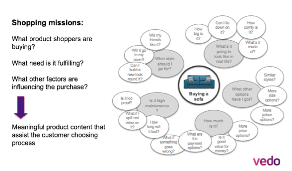
You have to be clear what products your shoppers want, why they are buying it, and what other factors are influencing their purchase.
The chart below gives examples of the needs and questions that sofa shoppers have, and all of these questions can be answered by product content.
What new information do I want to give my customers?
Now you can see what questions your customers are asking, you are able to assess your existing content more clearly.
This is the point to define the new types of information you want to provide to your shoppers and planning how you can add it into content mix, as in the table shown below:
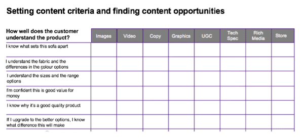
At this point, its important to look at all content types, including copy, technical specifications and even the store communications.
When you increase your focus on shopper needs, you have more clarity to define an effective content plan that will deliver a comprehensive and meaningful story to your customer base.
Go forward and be creative
From here you can move into an informed content planning process. Its important to build creativity into this content so that shoppers enjoy it as well as build their product knowledge in the process.
Visual commerce is essentially about building confidence in the customer. When a shopper gets the best information and understanding about a product, your increasing their confidence to buy.
 Thanks to Gabrielle O’Hare for sharing their advice and opinions in this post. Gabrielle O’Hare is the Content Strategy Director and co-founder of Vedo, a Visual Content consultancy based in the UK. Vedo work with retailers and brands to help them improve the way their shoppers experience products online, and have extensive experience in content planning and high volume content production. You can connect with her on LinkedIn.
From our sponsors: How to create product content to drive sales


