5 key trends for charity websites in 2016


Non-profits need to use big data and mobile to present clear messages in 2016
2015 has seen charities gaining increased confidence to streamline, simplify and even surprise. With increasing demands from an ever increasingly digital savvy audience, standing still has not been an option.
The larger charities are capitalising on ever more sophisticated opportunities gained from insights and improved team working and systems. The best of the medium to small size charity websites are finding cost-effective ways to improve experience such as featuring user-generated content.
There are a host of encouraging trends in the sector, but these ones stand out to me due to their take up across the sector and positive impact are:
1. Clarity of message
It would seem that many charities have pared down their offering on key pages to focus on core content and calls to action. For many charities, this is most clearly illustrated on the Home Page where the key prompt is a fundraising ask. Web visitors who need more bespoke information rely increasingly on search and drop down navigation.
2. Move to mobile
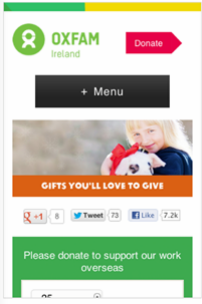
The simplicity of messaging is at its most crucial when deployed on hand-held devices. With the marked increase in mobile and tablet usage, there is a strong focus on making websites serve up responsive design to enhance user experience and response. These distilled formats see bolder calls to action such as more prominent buttons.
This example of using context in Charity marketing from Chris Pook at Marie Curie shows how messages and offers can be tailored and tested by device and channel (Email vs SMS).
3. Really big data
Charities along with other key sectors such as financial services, were leading database marketing in the pre-digital age. With their established understanding of audiences, particularly donor trends, charities are joining up the learnings across the myriad of digital platforms. The importance of knowing who and why people are visiting websites and how it ties in with people’s broader behaviour has never been more important. The convergence and interpretation of these data sources will become increasingly more important as charities strive to maintain relevance and sustainability.
Best practice tip – Use XY profile mapping to summarise personas
Once the range of personas have been created, it can be useful to organise them in a graphical way to show the differences in behaviours and characteristics of the groups to help external audiences. The mobile sector example below shows how personas are mapped to show how they can be assessed according to their technical and social confidence.
4. Do just one thing for us
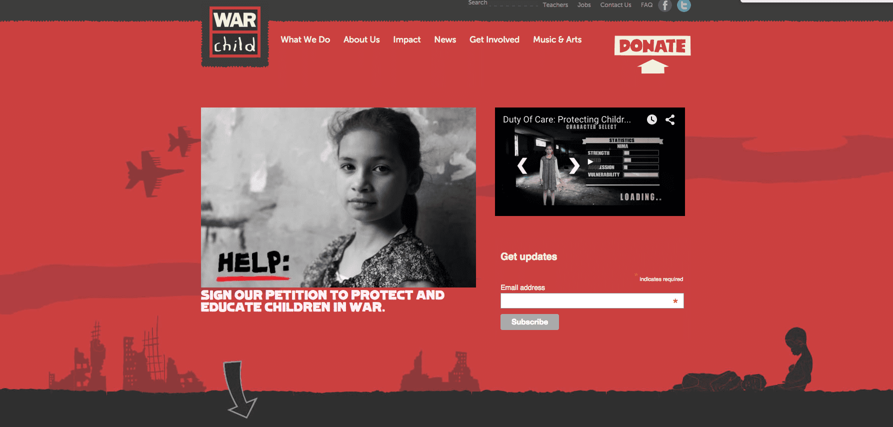
The intent to convert web visitors has stepped up a gear in the last year. This is especially true for the larger charities. It would appear that what the website is for has been refined and assessed with many choosing to have the primary purpose to donate. The ask often reflects a broader advertising campaign. As well as donation asks, there is also evidence of more prominent prompts to sign up to email lists or social media actions.

5. Teamwork
There is a move for digital to gain an increased share of voice from charity boards to staff at all levels. Over the last year, dedicated digital teams are increasingly collaborating, inspiring and informing. While I have highlighted singularity of purpose as a key trend, showing the full range of services and ways to support needs to be vibrantly illustrated. This is being achieved by strong content management and an incisive evaluation of web analytics.

Download Expert Member resource – Website practices for charities
This guide from charity digital marketing specialist Lucy Conlan will help you: Review your current approach comparing to other charity websites and align your website goals against objectives. It will also give you inspiration for improvements from examples of charity website best practices. .
Access the Website practices for charities
From our sponsors: 5 key trends for charity websites in 2016


